show the value when the spike and the dataset line crosses in the X axis
まだ誰も着手していません。
- 主要言語
- JavaScript
- スター
- 18.3k
- フォーク
- 2k
- 平均マージ
- 2日 12時間
- マージ済み PR(30日)
- 28
説明
Sorry, couldn't describe it better in the title, if someone could suggest an edit I'd appreciate.
My point is, when you have multiple datasets and you hover a line, a popup appears in the Y axis of every other line when it crosses the spike line. I'd like to use a feature where it can be shown the popups with the value of both X and Y axis. I'm attaching an image to help to explain my problem:
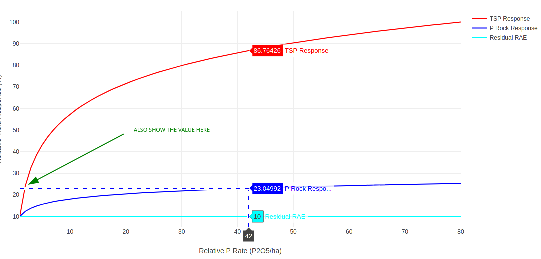
You see that I hovered the blue line and it showed the popups with the value of the red and cyan lines that met the Y axis, I want to show that same popup in the spot that I have drawn the green arrow indicating the value of the dataset when the line of the dataset and the line of the spike crosses in both axis...
Does anyone know a feature that can do that? Is that feasible? I couldn't find anything about that in the documentation of the spikes.
Thank you very much, great tool you guys developed here!
コントリビューションガイド
はじめの一歩
- issue を最後まで読み、次にプロジェクトのコントリビューションガイドを読みます。
- 着手することを issue にコメントします — 二人が同じ作業をするのを防げます。
- リポジトリをフォークし、ブランチを切って変更します。
- issue 番号を参照したプルリクエストを送ります。
調査の方向性
この issue では、ソースファイル、テスト、実装のエントリポイントのいずれも指定されていません。既存の spike ドキュメントと添付された例から始め、クロス軸の交点でポップアップが X 値と Y 値の両方をどのように報告するかを定義し、その後、複数のデータセットで動作を検証してください。
索引モデルが issue の本文から書いたものです。
評価
- 技術スタック
- javascript
- 領域
- data-visualization
- issue の種類
- 機能追加
- 難易度
- 5/5
- 見積もり時間
- 1週間以上
- 活発さ
- 停滞
- 明瞭さ
- 説明が足りない
- 初心者へのやさしさ
- 25/100