show the value when the spike and the dataset line crosses in the X axis
還沒有人認領這個 Issue。
- 主要語言
- JavaScript
- 星號
- 18.3k
- 分支
- 2k
- 平均合併
- 2 天 12 小時
- 30 天內合併 PR
- 28
描述
Sorry, couldn't describe it better in the title, if someone could suggest an edit I'd appreciate.
My point is, when you have multiple datasets and you hover a line, a popup appears in the Y axis of every other line when it crosses the spike line. I'd like to use a feature where it can be shown the popups with the value of both X and Y axis. I'm attaching an image to help to explain my problem:
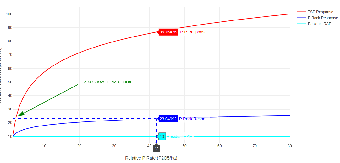
You see that I hovered the blue line and it showed the popups with the value of the red and cyan lines that met the Y axis, I want to show that same popup in the spot that I have drawn the green arrow indicating the value of the dataset when the line of the dataset and the line of the spike crosses in both axis...
Does anyone know a feature that can do that? Is that feasible? I couldn't find anything about that in the documentation of the spikes.
Thank you very much, great tool you guys developed here!
貢獻指南
從這裡開始
- 先讀完整個 Issue,再讀專案的貢獻指南。
- 在 Issue 下留言說明你要接手 —— 這能避免兩個人做同樣的事。
- Fork 儲存庫,在一個分支上完成修改。
- 送出 Pull Request,並在描述裡引用這個 Issue 編號。
研究方向
該 issue 未指明來源檔案、測試或實作進入點。先從現有的 spike 文件和附帶範例開始;定義彈出視窗應如何在交叉軸交點處回報 X 和 Y 值,然後在多個資料集上驗證該行為。
由索引模型根據 Issue 內容生成。
評估
- 技術堆疊
- javascript
- 領域
- data-visualization
- Issue 類型
- 功能
- 難度
- 5/5
- 預估耗時
- 一週以上
- 活躍度
- 停滯
- 描述清晰度
- 需要釐清
- 新手友好度
- 25/100