show the value when the spike and the dataset line crosses in the X axis
Dieses Issue hat noch niemand übernommen.
- Vorherrschende Sprache
- JavaScript
- Sterne
- 18.3k
- Forks
- 2k
- Ø Merge
- 2 T. 12 Std.
- Gemergte PRs (30 T.)
- 28
Beschreibung
Sorry, couldn't describe it better in the title, if someone could suggest an edit I'd appreciate.
My point is, when you have multiple datasets and you hover a line, a popup appears in the Y axis of every other line when it crosses the spike line. I'd like to use a feature where it can be shown the popups with the value of both X and Y axis. I'm attaching an image to help to explain my problem:
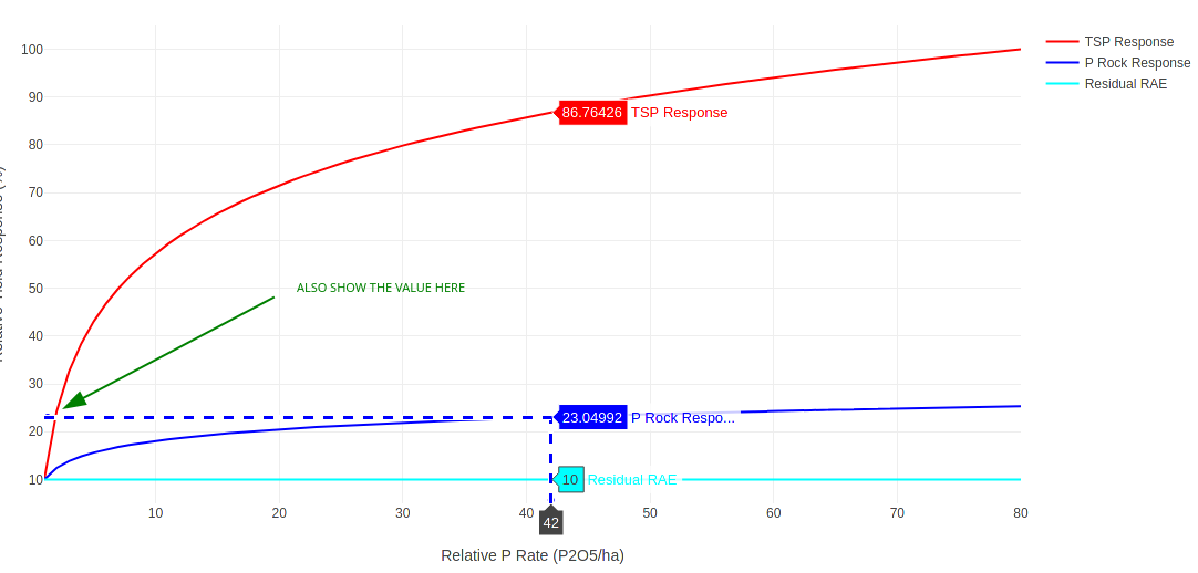
You see that I hovered the blue line and it showed the popups with the value of the red and cyan lines that met the Y axis, I want to show that same popup in the spot that I have drawn the green arrow indicating the value of the dataset when the line of the dataset and the line of the spike crosses in both axis...
Does anyone know a feature that can do that? Is that feasible? I couldn't find anything about that in the documentation of the spikes.
Thank you very much, great tool you guys developed here!
Beitragsleitfaden
Erste Schritte
- Lies das ganze Issue und danach den Beitragsleitfaden des Projekts.
- Schreib ins Issue, dass du es übernimmst — das erspart doppelte Arbeit.
- Forke das Repository und arbeite in einem Branch.
- Öffne einen Pull Request, der die Issue-Nummer nennt.
Rechercherichtung
Der Issue nennt keine Quelldatei, keinen Test und keinen Einstiegspunkt der Implementierung. Beginne mit der vorhandenen spike-Dokumentation und dem angehängten Beispiel; definiere, wie das Popup am Schnittpunkt der Querachsen sowohl X- als auch Y-Werte melden soll, und überprüfe anschließend das Verhalten anhand mehrerer Datensätze.
Vom Indexierungsmodell aus dem Issue-Text verfasst.
Bewertung
- Tech-Stack
- javascript
- Bereich
- data-visualization
- Issue-Typ
- Feature
- Schwierigkeit
- 5/5
- Geschätzter Aufwand
- Über eine Woche
- Aktivitätsstatus
- Veraltet
- Klarheit
- Muss geklärt werden
- Anfängerfreundlichkeit
- 25/100