Markers are not alligned with bars when a double horizontal axis is used
オープン
まだ誰も着手していません。
- 主要言語
- R
- スター
- 2.7k
- フォーク
- 641
- PR マージ指標
- 30日以内にマージされた PR はありません
説明
Plotly behaves strangely when two sets of data are superimposed, and there is a double horizontal axis.
Bars overlayed on bars give no issue: see the following reprex.
library(plotly)
#> Loading required package: ggplot2
#>
#> Attaching package: 'plotly'
#> The following object is masked from 'package:ggplot2':
#>
#>     last_plot
#> The following object is masked from 'package:stats':
#>
#>     filter
#> The following object is masked from 'package:graphics':
#>
#>     layout

plot_ly() %>%
  add_trace(x = ~1:31,
            y = ~1:31,
            name = 'blue data',
            type = 'bar') %>%
  add_trace(x = ~101:131,
            y = ~31:1,
            opacity = 0.7,
            name = 'orange data',
            type = 'bar',
            xaxis = 'x2') %>%
  layout(xaxis = list(title = ''),
         xaxis2 = list(
           overlaying = "x",
           side = "top")
  )
#> Warning: `arrange_()` is deprecated as of dplyr 0.7.0.
#> Please use `arrange()` instead.
#> See vignette('programming') for more help
#> This warning is displayed once every 8 hours.
#> Call `lifecycle::last_warnings()` to see where this warning was generated.
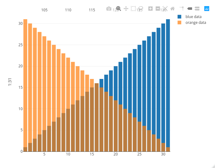
Created on 2020-10-29 by the reprex package (v0.3.0)
Now look at what happens if I replace the orange bars with orange markers: the second x axis on the top is squeezed between the second and the second to last bar, messing up the visualization.
library(plotly)
#> Loading required package: ggplot2
#>
#> Attaching package: 'plotly'
#> The following object is masked from 'package:ggplot2':
#>
#>     last_plot
#> The following object is masked from 'package:stats':
#>
#>     filter
#> The following object is masked from 'package:graphics':
#>
#>     layout

plot_ly() %>%
  add_trace(x = ~1:31,
            y = ~1:31,
            name = 'blue data',
            type = 'bar') %>%
  add_trace(x = ~101:131,
            y = ~31:1,
            opacity = 0.7,
            name = 'orange data',
            type = 'scatter',
            mode = 'markers',
            xaxis = 'x2') %>%
  layout(xaxis = list(title = ''),
         xaxis2 = list(
           overlaying = "x",
           side = "top")
  )
#> Warning: `arrange_()` is deprecated as of dplyr 0.7.0.
#> Please use `arrange()` instead.
#> See vignette('programming') for more help
#> This warning is displayed once every 8 hours.
#> Call `lifecycle::last_warnings()` to see where this warning was generated.
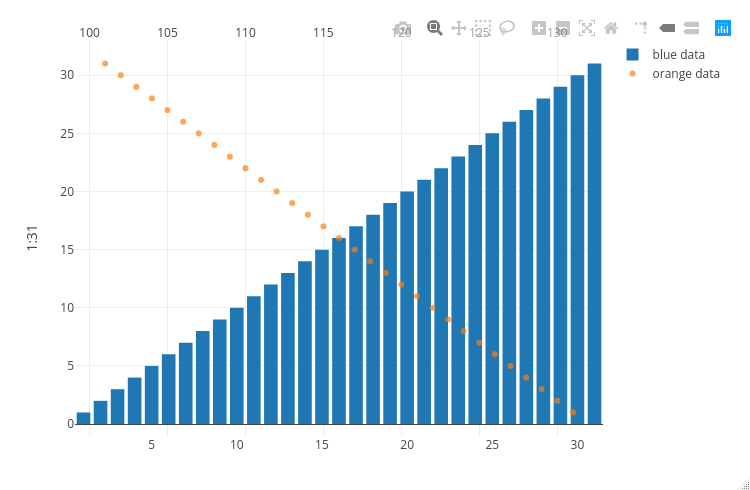
Created on 2020-10-29 by the reprex package (v0.3.0)
コントリビューションガイド
はじめの一歩
- issue を最後まで読み、次にプロジェクトのコントリビューションガイドを読みます。
- 着手することを issue にコメントします — 二人が同じ作業をするのを防げます。
- リポジトリをフォークし、ブランチを切って変更します。
- issue 番号を参照したプルリクエストを送ります。
調査の方向性
まず、add_trace() と layout() を使った 2 つの plot_ly() の例を実行し、棒グラフの場合とマーカーの場合を比較します。R のプロットエントリポイントが、重ね合わせられた xaxis と xaxis2 の設定をどのように処理するかを追跡します。マーカーが上側の軸を押しつぶすことなく、棒と同じ水平位置合わせを使用すれば完了です。
索引モデルが issue の本文から書いたものです。
評価
- 技術スタック
- r
- 領域
- data-visualization
- issue の種類
- バグ
- 難易度
- 4/5
- 見積もり時間
- 3〜5日
- 活発さ
- 停滞
- 明瞭さ
- おおむね明確
- 初心者へのやさしさ
- 35/100