Markers are not alligned with bars when a double horizontal axis is used
Nessuno ha ancora preso questa issue.
- Lingua principale
- R
- Stelle
- 2.7k
- Fork
- 641
- Metriche di merge delle PR
- Nessuna PR unita negli ultimi 30g
Descrizione
Plotly behaves strangely when two sets of data are superimposed, and there is a double horizontal axis.
Bars overlayed on bars give no issue: see the following reprex.
library(plotly)
#> Loading required package: ggplot2
#>
#> Attaching package: 'plotly'
#> The following object is masked from 'package:ggplot2':
#>
#>     last_plot
#> The following object is masked from 'package:stats':
#>
#>     filter
#> The following object is masked from 'package:graphics':
#>
#>     layout

plot_ly() %>%
  add_trace(x = ~1:31,
            y = ~1:31,
            name = 'blue data',
            type = 'bar') %>%
  add_trace(x = ~101:131,
            y = ~31:1,
            opacity = 0.7,
            name = 'orange data',
            type = 'bar',
            xaxis = 'x2') %>%
  layout(xaxis = list(title = ''),
         xaxis2 = list(
           overlaying = "x",
           side = "top")
  )
#> Warning: `arrange_()` is deprecated as of dplyr 0.7.0.
#> Please use `arrange()` instead.
#> See vignette('programming') for more help
#> This warning is displayed once every 8 hours.
#> Call `lifecycle::last_warnings()` to see where this warning was generated.
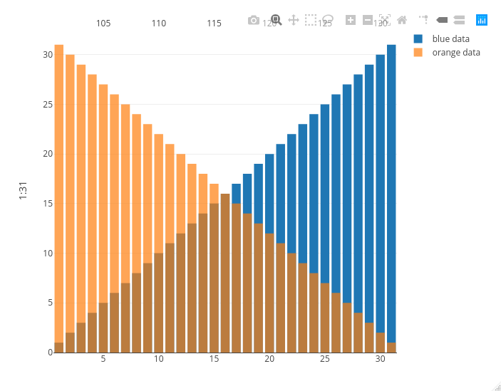
Created on 2020-10-29 by the reprex package (v0.3.0)
Now look at what happens if I replace the orange bars with orange markers: the second x axis on the top is squeezed between the second and the second to last bar, messing up the visualization.
library(plotly)
#> Loading required package: ggplot2
#>
#> Attaching package: 'plotly'
#> The following object is masked from 'package:ggplot2':
#>
#>     last_plot
#> The following object is masked from 'package:stats':
#>
#>     filter
#> The following object is masked from 'package:graphics':
#>
#>     layout

plot_ly() %>%
  add_trace(x = ~1:31,
            y = ~1:31,
            name = 'blue data',
            type = 'bar') %>%
  add_trace(x = ~101:131,
            y = ~31:1,
            opacity = 0.7,
            name = 'orange data',
            type = 'scatter',
            mode = 'markers',
            xaxis = 'x2') %>%
  layout(xaxis = list(title = ''),
         xaxis2 = list(
           overlaying = "x",
           side = "top")
  )
#> Warning: `arrange_()` is deprecated as of dplyr 0.7.0.
#> Please use `arrange()` instead.
#> See vignette('programming') for more help
#> This warning is displayed once every 8 hours.
#> Call `lifecycle::last_warnings()` to see where this warning was generated.
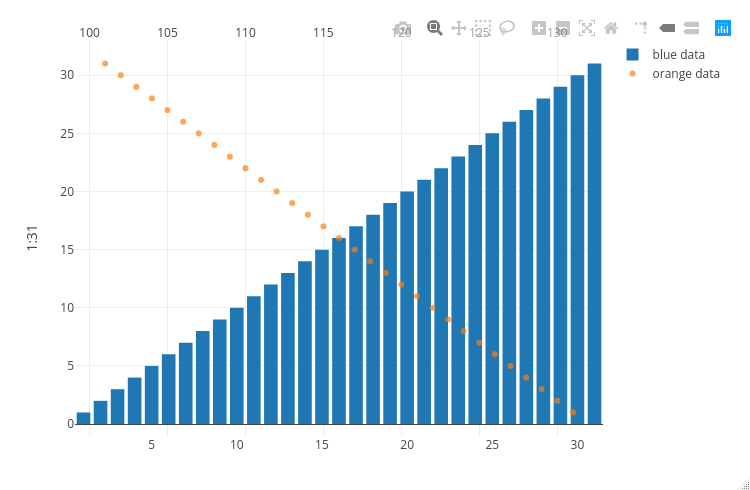
Created on 2020-10-29 by the reprex package (v0.3.0)
Guida per i contributori
Apri la guida per i contributori
Come iniziare
- Leggi tutta la issue e poi la guida ai contributi del progetto.
- Commenta sulla issue per dire che te ne occupi tu — evita che due persone facciano lo stesso lavoro.
- Fai un fork del repository e lavora su un branch.
- Apri una pull request che faccia riferimento al numero della issue.
Direzione di ricerca
Inizia eseguendo i due esempi di plot_ly() con add_trace() e layout(), confrontando i casi con barre e marker. Segui come i punti di ingresso del plotting in R gestiscono le configurazioni sovrapposte di xaxis e xaxis2; il lavoro è completato quando i marker usano lo stesso allineamento orizzontale delle barre senza comprimere l’asse superiore.
Scritto dal modello di indicizzazione a partire dal testo della issue.
Valutazione
- Stack tecnologico
- r
- Ambito
- data-visualization
- Tipo di issue
- Bug
- Difficoltà
- 4/5
- Tempo stimato
- 3-5 giorni
- Stato di attività
- Ferma
- Chiarezza
- Abbastanza chiara
- Idoneità per principianti
- 35/100