Markers are not alligned with bars when a double horizontal axis is used
Nadie ha tomado este issue todavía.
- Lenguaje dominante
- R
- Estrellas
- 2.7k
- Forks
- 641
- Métricas de merge de PR
- Sin PR fusionados en 30 d
Descripción
Plotly behaves strangely when two sets of data are superimposed, and there is a double horizontal axis.
Bars overlayed on bars give no issue: see the following reprex.
library(plotly)
#> Loading required package: ggplot2
#>
#> Attaching package: 'plotly'
#> The following object is masked from 'package:ggplot2':
#>
#>     last_plot
#> The following object is masked from 'package:stats':
#>
#>     filter
#> The following object is masked from 'package:graphics':
#>
#>     layout

plot_ly() %>%
  add_trace(x = ~1:31,
            y = ~1:31,
            name = 'blue data',
            type = 'bar') %>%
  add_trace(x = ~101:131,
            y = ~31:1,
            opacity = 0.7,
            name = 'orange data',
            type = 'bar',
            xaxis = 'x2') %>%
  layout(xaxis = list(title = ''),
         xaxis2 = list(
           overlaying = "x",
           side = "top")
  )
#> Warning: `arrange_()` is deprecated as of dplyr 0.7.0.
#> Please use `arrange()` instead.
#> See vignette('programming') for more help
#> This warning is displayed once every 8 hours.
#> Call `lifecycle::last_warnings()` to see where this warning was generated.
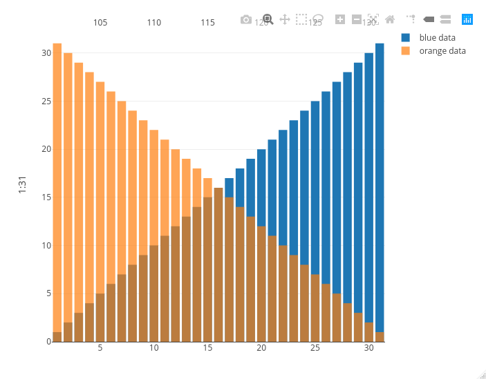
Created on 2020-10-29 by the reprex package (v0.3.0)
Now look at what happens if I replace the orange bars with orange markers: the second x axis on the top is squeezed between the second and the second to last bar, messing up the visualization.
library(plotly)
#> Loading required package: ggplot2
#>
#> Attaching package: 'plotly'
#> The following object is masked from 'package:ggplot2':
#>
#>     last_plot
#> The following object is masked from 'package:stats':
#>
#>     filter
#> The following object is masked from 'package:graphics':
#>
#>     layout

plot_ly() %>%
  add_trace(x = ~1:31,
            y = ~1:31,
            name = 'blue data',
            type = 'bar') %>%
  add_trace(x = ~101:131,
            y = ~31:1,
            opacity = 0.7,
            name = 'orange data',
            type = 'scatter',
            mode = 'markers',
            xaxis = 'x2') %>%
  layout(xaxis = list(title = ''),
         xaxis2 = list(
           overlaying = "x",
           side = "top")
  )
#> Warning: `arrange_()` is deprecated as of dplyr 0.7.0.
#> Please use `arrange()` instead.
#> See vignette('programming') for more help
#> This warning is displayed once every 8 hours.
#> Call `lifecycle::last_warnings()` to see where this warning was generated.
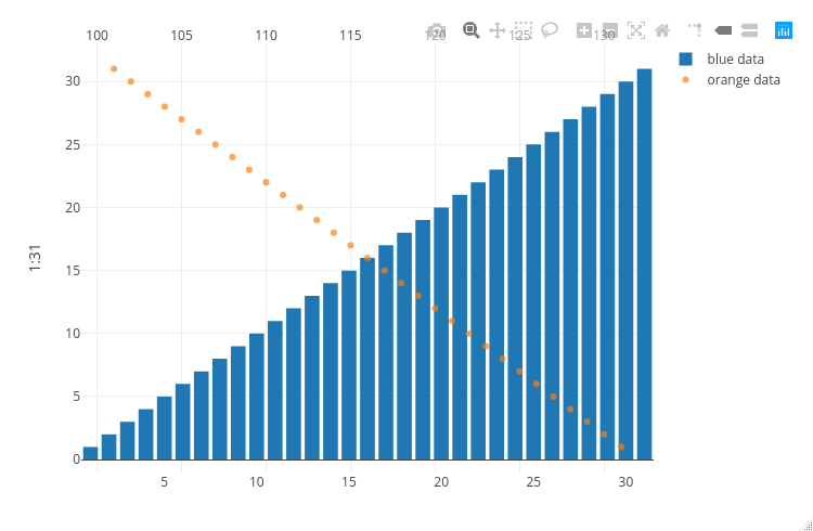
Created on 2020-10-29 by the reprex package (v0.3.0)
Guía de contribución
Primeros pasos
- Lee el issue completo y luego la guía de contribución del proyecto.
- Comenta en el issue que vas a ocuparte — evita que dos personas hagan lo mismo.
- Haz un fork del repositorio y trabaja en una rama.
- Abre un pull request que haga referencia al número del issue.
Línea de trabajo
Comienza ejecutando los dos ejemplos de plot_ly() con add_trace() y layout(), comparando los casos de barras y marcadores. Sigue cómo los puntos de entrada de trazado de R gestionan las configuraciones superpuestas de xaxis y xaxis2; se considera terminado cuando los marcadores usan la misma alineación horizontal que las barras sin comprimir el eje superior.
Escrito por el modelo de indexación a partir del texto del issue.
Evaluación
- Stack tecnológico
- r
- Área
- data-visualization
- Tipo de issue
- Error
- Dificultad
- 4/5
- Tiempo estimado
- 3-5 días
- Estado de actividad
- Estancado
- Claridad
- Bastante claro
- Aptitud para principiantes
- 35/100