Markers are not alligned with bars when a double horizontal axis is used
Personne n'a encore pris cette issue.
- Langage dominant
- R
- Étoiles
- 2.7k
- Forks
- 641
- Métriques de merge des PR
- Aucune PR mergée en 30 j
Description
Plotly behaves strangely when two sets of data are superimposed, and there is a double horizontal axis.
Bars overlayed on bars give no issue: see the following reprex.
library(plotly)
#> Loading required package: ggplot2
#>
#> Attaching package: 'plotly'
#> The following object is masked from 'package:ggplot2':
#>
#>     last_plot
#> The following object is masked from 'package:stats':
#>
#>     filter
#> The following object is masked from 'package:graphics':
#>
#>     layout

plot_ly() %>%
  add_trace(x = ~1:31,
            y = ~1:31,
            name = 'blue data',
            type = 'bar') %>%
  add_trace(x = ~101:131,
            y = ~31:1,
            opacity = 0.7,
            name = 'orange data',
            type = 'bar',
            xaxis = 'x2') %>%
  layout(xaxis = list(title = ''),
         xaxis2 = list(
           overlaying = "x",
           side = "top")
  )
#> Warning: `arrange_()` is deprecated as of dplyr 0.7.0.
#> Please use `arrange()` instead.
#> See vignette('programming') for more help
#> This warning is displayed once every 8 hours.
#> Call `lifecycle::last_warnings()` to see where this warning was generated.
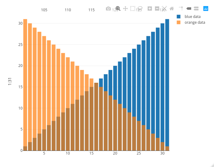
Created on 2020-10-29 by the reprex package (v0.3.0)
Now look at what happens if I replace the orange bars with orange markers: the second x axis on the top is squeezed between the second and the second to last bar, messing up the visualization.
library(plotly)
#> Loading required package: ggplot2
#>
#> Attaching package: 'plotly'
#> The following object is masked from 'package:ggplot2':
#>
#>     last_plot
#> The following object is masked from 'package:stats':
#>
#>     filter
#> The following object is masked from 'package:graphics':
#>
#>     layout

plot_ly() %>%
  add_trace(x = ~1:31,
            y = ~1:31,
            name = 'blue data',
            type = 'bar') %>%
  add_trace(x = ~101:131,
            y = ~31:1,
            opacity = 0.7,
            name = 'orange data',
            type = 'scatter',
            mode = 'markers',
            xaxis = 'x2') %>%
  layout(xaxis = list(title = ''),
         xaxis2 = list(
           overlaying = "x",
           side = "top")
  )
#> Warning: `arrange_()` is deprecated as of dplyr 0.7.0.
#> Please use `arrange()` instead.
#> See vignette('programming') for more help
#> This warning is displayed once every 8 hours.
#> Call `lifecycle::last_warnings()` to see where this warning was generated.
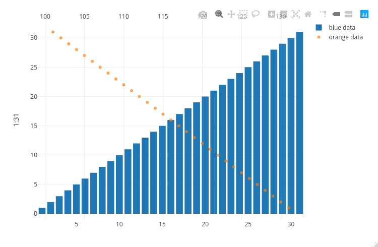
Created on 2020-10-29 by the reprex package (v0.3.0)
Guide de contribution
Ouvrir le guide de contribution
Par où commencer
- Lisez l'issue en entier, puis le guide de contribution du projet.
- Signalez en commentaire que vous la prenez — cela évite que deux personnes fassent le même travail.
- Forkez le dépôt et travaillez sur une branche.
- Ouvrez une pull request qui référence le numéro de l'issue.
Piste de recherche
Commencez par exécuter les deux exemples de plot_ly() avec add_trace() et layout(), en comparant les cas des barres et des marqueurs. Suivez la manière dont les points d’entrée de traçage R gèrent les configurations superposées de xaxis et xaxis2 ; le travail est terminé lorsque les marqueurs utilisent le même alignement horizontal que les barres sans comprimer l’axe supérieur.
Rédigé par le modèle d'indexation à partir du texte de l'issue.
Évaluation
- Stack technique
- r
- Domaine
- data-visualization
- Type d'issue
- Bug
- Difficulté
- 4/5
- Temps estimé
- 3-5 jours
- Activité
- À l'abandon
- Clarté
- Plutôt claire
- Accessibilité débutants
- 35/100