problems with mapbox density heatmap color
まだ誰も着手していません。
- 主要言語
- JavaScript
- スター
- 18.3k
- フォーク
- 2k
- 平均マージ
- 2日 12時間
- マージ済み PR(30日)
- 28
説明
Upon reviewing the demonstration provided on https://plotly.com/javascript/mapbox-density-heatmaps, I have observed an issue with the coloring of the last heat map chart that displays earthquake magnitudes. When a user mouses out too much, the coloring appears to be incorrect. It is unclear whether this is intended behavior or a bug, but it does not appear logical to end users and seems like a bug.
For instance, if a user mouses out too far, numerous yellow areas are displayed, giving the impression that all of these areas have experienced 9-degree earthquakes. As a result, it appears as if nearly the entire earth has experienced a 9-degree earthquake, as shown in the image provided. However, when a user zooms in to examine specific locations, the yellow spots disappear, resulting in an absence of yellow spots. This behavior renders the chart significantly misleading to the end user.
I would like to inquire if you are aware of this issue. Is there a workaround or a setting that can be modified to prevent this from happening when a user mouses out too much?
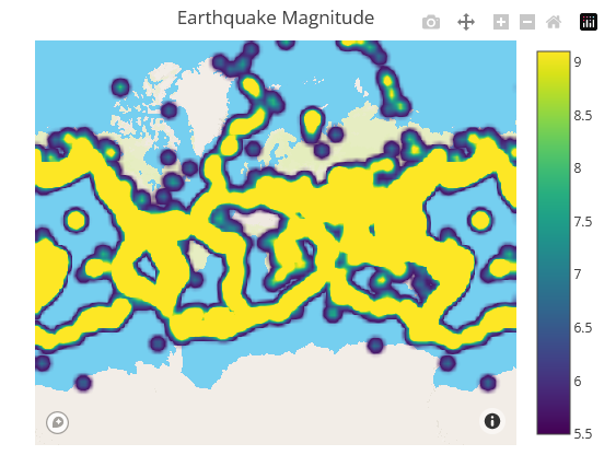
Zoom out example
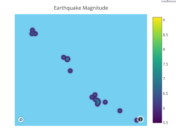
Zoom in example
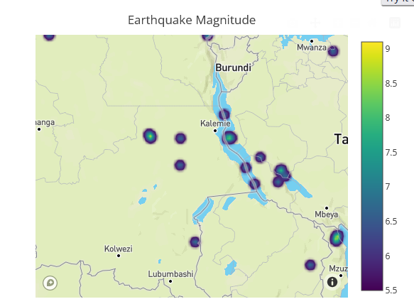
Zoom in example
Same behavior has the previous chart as well, which is type of densitymapbox:

Zoom out example

Zoom in example

Zoom in example
However even if mouse in the colors are not right:


These 2 points above have very different values. One is 7 the other is 5.5. According to legend scale we should see different colors

But they are very similar and end user can not see the difference here.
コントリビューションガイド
はじめの一歩
- issue を最後まで読み、次にプロジェクトのコントリビューションガイドを読みます。
- 着手することを issue にコメントします — 二人が同じ作業をするのを防げます。
- リポジトリをフォークし、ブランチを切って変更します。
- issue 番号を参照したプルリクエストを送ります。
調査の方向性
Mapbox の density heatmap デモンストレーションから始め、ズームインおよびズームアウト時に報告された動作を再現します。density heatmap と densitymapbox の両方の例で、地震のマグニチュードの色を比較します。報告された値 7 と 5.5 も含めてください。ズームレベルをまたいで可視化がマグニチュードの違いを一貫して伝えるか、確認済みの回避策を文書化できれば完了です。
索引モデルが issue の本文から書いたものです。
評価
- 技術スタック
- javascript
- 領域
- data-visualization
- issue の種類
- バグ
- 難易度
- 4/5
- 見積もり時間
- 3〜5日
- 活発さ
- 停滞
- 明瞭さ
- 説明が足りない
- 初心者へのやさしさ
- 32/100