problems with mapbox density heatmap color
Nadie ha tomado este issue todavía.
- Lenguaje dominante
- JavaScript
- Estrellas
- 18.3k
- Forks
- 2k
- Merge medio
- 2 d 12 h
- PR fusionados (30 d)
- 28
Descripción
Upon reviewing the demonstration provided on https://plotly.com/javascript/mapbox-density-heatmaps, I have observed an issue with the coloring of the last heat map chart that displays earthquake magnitudes. When a user mouses out too much, the coloring appears to be incorrect. It is unclear whether this is intended behavior or a bug, but it does not appear logical to end users and seems like a bug.
For instance, if a user mouses out too far, numerous yellow areas are displayed, giving the impression that all of these areas have experienced 9-degree earthquakes. As a result, it appears as if nearly the entire earth has experienced a 9-degree earthquake, as shown in the image provided. However, when a user zooms in to examine specific locations, the yellow spots disappear, resulting in an absence of yellow spots. This behavior renders the chart significantly misleading to the end user.
I would like to inquire if you are aware of this issue. Is there a workaround or a setting that can be modified to prevent this from happening when a user mouses out too much?
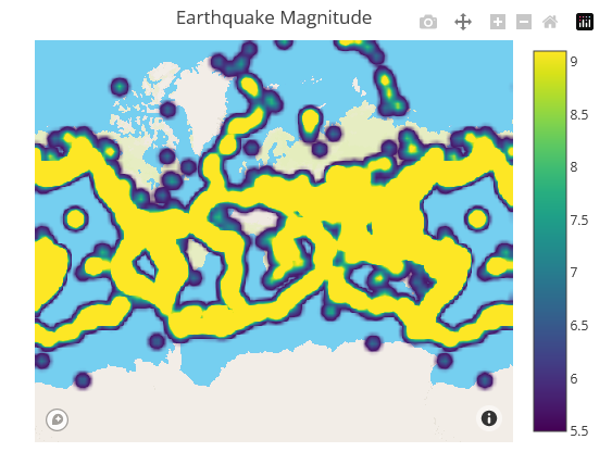
Zoom out example
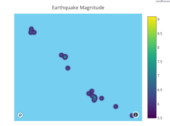
Zoom in example
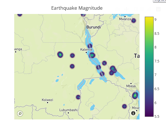
Zoom in example
Same behavior has the previous chart as well, which is type of densitymapbox:

Zoom out example

Zoom in example

Zoom in example
However even if mouse in the colors are not right:


These 2 points above have very different values. One is 7 the other is 5.5. According to legend scale we should see different colors

But they are very similar and end user can not see the difference here.
Guía de contribución
Primeros pasos
- Lee el issue completo y luego la guía de contribución del proyecto.
- Comenta en el issue que vas a ocuparte — evita que dos personas hagan lo mismo.
- Haz un fork del repositorio y trabaja en una rama.
- Abre un pull request que haga referencia al número del issue.
Línea de trabajo
Comienza con la demostración de Mapbox de density heatmap y reproduce el comportamiento reportado al acercar y alejar el zoom. Compara los colores de la magnitud de los terremotos tanto en los ejemplos density heatmap como densitymapbox, incluidos los valores reportados 7 y 5.5. Se considera terminado cuando la visualización comunica de forma coherente las diferencias de magnitud en distintos niveles de zoom o documenta una solución alternativa confirmada.
Escrito por el modelo de indexación a partir del texto del issue.
Evaluación
- Stack tecnológico
- javascript
- Área
- data-visualization
- Tipo de issue
- Error
- Dificultad
- 4/5
- Tiempo estimado
- 3-5 días
- Estado de actividad
- Estancado
- Claridad
- Necesita aclaración
- Aptitud para principiantes
- 32/100