problems with mapbox density heatmap color
Dieses Issue hat noch niemand übernommen.
- Vorherrschende Sprache
- JavaScript
- Sterne
- 18.3k
- Forks
- 2k
- Ø Merge
- 2 T. 12 Std.
- Gemergte PRs (30 T.)
- 28
Beschreibung
Upon reviewing the demonstration provided on https://plotly.com/javascript/mapbox-density-heatmaps, I have observed an issue with the coloring of the last heat map chart that displays earthquake magnitudes. When a user mouses out too much, the coloring appears to be incorrect. It is unclear whether this is intended behavior or a bug, but it does not appear logical to end users and seems like a bug.
For instance, if a user mouses out too far, numerous yellow areas are displayed, giving the impression that all of these areas have experienced 9-degree earthquakes. As a result, it appears as if nearly the entire earth has experienced a 9-degree earthquake, as shown in the image provided. However, when a user zooms in to examine specific locations, the yellow spots disappear, resulting in an absence of yellow spots. This behavior renders the chart significantly misleading to the end user.
I would like to inquire if you are aware of this issue. Is there a workaround or a setting that can be modified to prevent this from happening when a user mouses out too much?
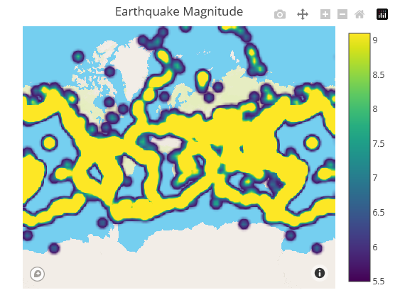
Zoom out example
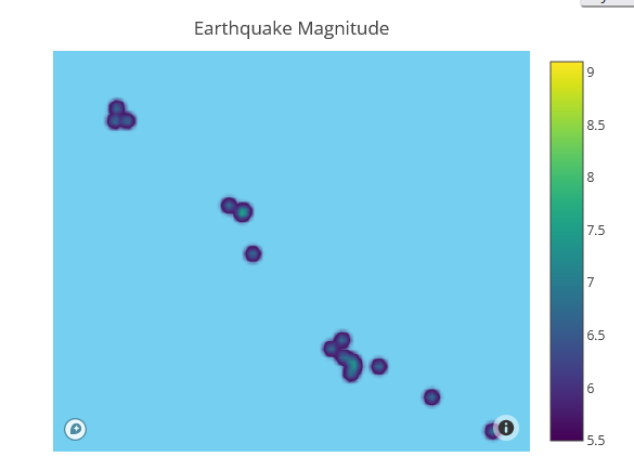
Zoom in example
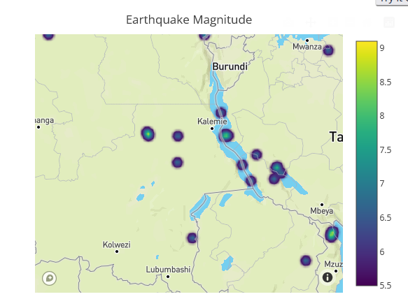
Zoom in example
Same behavior has the previous chart as well, which is type of densitymapbox:

Zoom out example

Zoom in example

Zoom in example
However even if mouse in the colors are not right:


These 2 points above have very different values. One is 7 the other is 5.5. According to legend scale we should see different colors

But they are very similar and end user can not see the difference here.
Beitragsleitfaden
Erste Schritte
- Lies das ganze Issue und danach den Beitragsleitfaden des Projekts.
- Schreib ins Issue, dass du es übernimmst — das erspart doppelte Arbeit.
- Forke das Repository und arbeite in einem Branch.
- Öffne einen Pull Request, der die Issue-Nummer nennt.
Rechercherichtung
Beginnen Sie mit der Mapbox-Demonstration zur Dichte-Heatmap und reproduzieren Sie das gemeldete Verhalten beim Hinein- und Herauszoomen. Vergleichen Sie die Farben der Erdbebenmagnituden sowohl im Beispiel density heatmap als auch im Beispiel densitymapbox, einschließlich der gemeldeten Werte 7 und 5.5. Als abgeschlossen gilt die Aufgabe, wenn die Visualisierung Magnitudenunterschiede über verschiedene Zoomstufen hinweg konsistent vermittelt oder einen bestätigten Workaround dokumentiert.
Vom Indexierungsmodell aus dem Issue-Text verfasst.
Bewertung
- Tech-Stack
- javascript
- Bereich
- data-visualization
- Issue-Typ
- Bug
- Schwierigkeit
- 4/5
- Geschätzter Aufwand
- 3-5 Tage
- Aktivitätsstatus
- Veraltet
- Klarheit
- Muss geklärt werden
- Anfängerfreundlichkeit
- 32/100