problems with mapbox density heatmap color
Nessuno ha ancora preso questa issue.
- Lingua principale
- JavaScript
- Stelle
- 18.3k
- Fork
- 2k
- Merge medio
- 2g 12h
- PR unite (30g)
- 28
Descrizione
Upon reviewing the demonstration provided on https://plotly.com/javascript/mapbox-density-heatmaps, I have observed an issue with the coloring of the last heat map chart that displays earthquake magnitudes. When a user mouses out too much, the coloring appears to be incorrect. It is unclear whether this is intended behavior or a bug, but it does not appear logical to end users and seems like a bug.
For instance, if a user mouses out too far, numerous yellow areas are displayed, giving the impression that all of these areas have experienced 9-degree earthquakes. As a result, it appears as if nearly the entire earth has experienced a 9-degree earthquake, as shown in the image provided. However, when a user zooms in to examine specific locations, the yellow spots disappear, resulting in an absence of yellow spots. This behavior renders the chart significantly misleading to the end user.
I would like to inquire if you are aware of this issue. Is there a workaround or a setting that can be modified to prevent this from happening when a user mouses out too much?
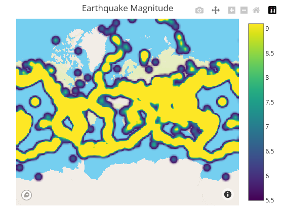
Zoom out example
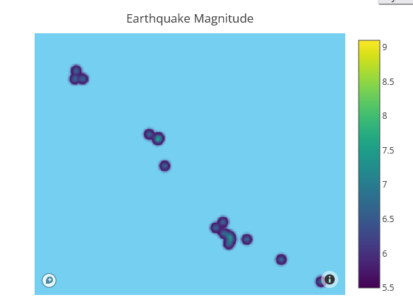
Zoom in example
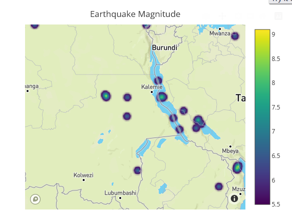
Zoom in example
Same behavior has the previous chart as well, which is type of densitymapbox:

Zoom out example

Zoom in example

Zoom in example
However even if mouse in the colors are not right:


These 2 points above have very different values. One is 7 the other is 5.5. According to legend scale we should see different colors

But they are very similar and end user can not see the difference here.
Guida per i contributori
Apri la guida per i contributori
Come iniziare
- Leggi tutta la issue e poi la guida ai contributi del progetto.
- Commenta sulla issue per dire che te ne occupi tu — evita che due persone facciano lo stesso lavoro.
- Fai un fork del repository e lavora su un branch.
- Apri una pull request che faccia riferimento al numero della issue.
Direzione di ricerca
Inizia con la dimostrazione di Mapbox di density heatmap e riproduci il comportamento segnalato durante lo zoom avanti e indietro. Confronta i colori delle magnitudo dei terremoti sia negli esempi density heatmap che densitymapbox, inclusi i valori segnalati 7 e 5.5. Il lavoro è completo quando la visualizzazione comunica in modo coerente le differenze di magnitudo tra i livelli di zoom oppure documenta una soluzione alternativa confermata.
Scritto dal modello di indicizzazione a partire dal testo della issue.
Valutazione
- Stack tecnologico
- javascript
- Ambito
- data-visualization
- Tipo di issue
- Bug
- Difficoltà
- 4/5
- Tempo stimato
- 3-5 giorni
- Stato di attività
- Ferma
- Chiarezza
- Da chiarire
- Idoneità per principianti
- 32/100