problems with mapbox density heatmap color
还没有人认领这个 Issue。
- 主要语言
- JavaScript
- 星标
- 18.3k
- 派生
- 2k
- 平均合并
- 2 天 12 小时
- 30 天内合并 PR
- 28
描述
Upon reviewing the demonstration provided on https://plotly.com/javascript/mapbox-density-heatmaps, I have observed an issue with the coloring of the last heat map chart that displays earthquake magnitudes. When a user mouses out too much, the coloring appears to be incorrect. It is unclear whether this is intended behavior or a bug, but it does not appear logical to end users and seems like a bug.
For instance, if a user mouses out too far, numerous yellow areas are displayed, giving the impression that all of these areas have experienced 9-degree earthquakes. As a result, it appears as if nearly the entire earth has experienced a 9-degree earthquake, as shown in the image provided. However, when a user zooms in to examine specific locations, the yellow spots disappear, resulting in an absence of yellow spots. This behavior renders the chart significantly misleading to the end user.
I would like to inquire if you are aware of this issue. Is there a workaround or a setting that can be modified to prevent this from happening when a user mouses out too much?
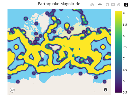
Zoom out example
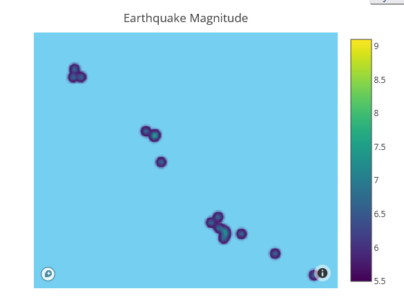
Zoom in example
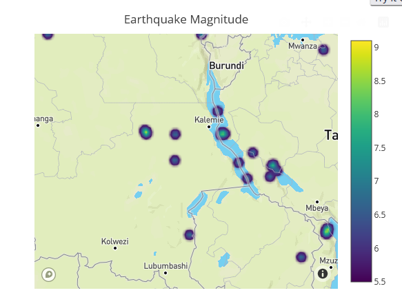
Zoom in example
Same behavior has the previous chart as well, which is type of densitymapbox:

Zoom out example

Zoom in example

Zoom in example
However even if mouse in the colors are not right:


These 2 points above have very different values. One is 7 the other is 5.5. According to legend scale we should see different colors

But they are very similar and end user can not see the difference here.
贡献指南
从这里开始
- 先读完整个 Issue,再读项目的贡献指南。
- 在 Issue 下留言说明你要接手 —— 这能避免两个人做同样的事。
- Fork 仓库,在一个分支上完成修改。
- 提交 Pull Request,并在描述里引用这个 Issue 编号。
调研方向
从 Mapbox 的 density heatmap 演示开始,在放大和缩小时复现报告的行为。比较 density heatmap 和 densitymapbox 示例中地震震级的颜色,包括报告的值 7 和 5.5。完成标准是:可视化能够在不同缩放级别上一致地传达震级差异,或记录一个已确认的 workaround。
由索引模型根据 Issue 内容生成。
评估
- 技术栈
- javascript
- 领域
- data-visualization
- Issue 类型
- 缺陷
- 难度
- 4/5
- 预计耗时
- 3-5 天
- 活跃度
- 停滞
- 描述清晰度
- 需要澄清
- 新手友好度
- 32/100