Wrong time displayed in hover text for some chart types
オープン
まだ誰も着手していません。
- 主要言語
- R
- スター
- 2.7k
- フォーク
- 641
- PR マージ指標
- 30日以内にマージされた PR はありません
説明
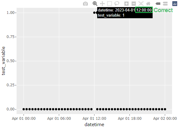
In the London time zone in BST period, the time displayed in the hover text is incorrect and is offset by one hour when converting a ggplot chart to Plotly. The issue is visible with bar chart and area chart, but not present with line chart and scatter plot. (Though I haven't tested all chart types so the issue could be more widespread.) The problem is present in plotly version 4.10.0 (ggplot2 version 3.6.6), but was not present in plotly version 4.9.3 (ggplot2 version 3.0.0).
library(ggplot2)
library(plotly)
library(lubridate)

Sys.setenv(TZ = "Europe/London")

datetime <- seq(ymd_hm("2023-04-01 00:00"), ymd_hm("2023-04-02 00:00"), by = "30 min")
df <- as.data.frame(datetime)
df$test_variable <- ifelse(df$datetime == ymd_hm("2023-04-01 12:00"), 1, 0)

#Line chart - no issue
ggplotly(
  ggplot(df, aes(datetime, test_variable)) +
    geom_line()
)

#Scatter plot - no issue
ggplotly(
  ggplot(df, aes(datetime, test_variable)) +
    geom_point()
)

#Bar chart - wrong time displayed
ggplotly(
  ggplot(df, aes(datetime, test_variable)) +
    geom_col()
)

#Area chart - wrong time displayed
ggplotly(
  ggplot(df, aes(datetime, test_variable)) +
    geom_area()
)



コントリビューションガイド
はじめの一歩
- issue を最後まで読み、次にプロジェクトのコントリビューションガイドを読みます。
- 着手することを issue にコメントします — 二人が同じ作業をするのを防げます。
- リポジトリをフォークし、ブランチを切って変更します。
- issue 番号を参照したプルリクエストを送ります。
調査の方向性
BST期間のEurope/Londonを使用する、提供されたRの再現コードから始め、geom_col()およびgeom_area()に対するggplotly()の出力を、折れ線グラフおよび散布図と比較します。対象となるグラフタイプでホバーテキストに正しい現地時刻が表示され、すでに動作しているグラフタイプにリグレッションが発生しなければ完了です。
索引モデルが issue の本文から書いたものです。
評価
- 技術スタック
- r
- 領域
- data-visualization
- issue の種類
- バグ
- 難易度
- 3/5
- 見積もり時間
- 1〜2日
- 活発さ
- 停滞
- 明瞭さ
- おおむね明確
- 初心者へのやさしさ
- 50/100