Wrong time displayed in hover text for some chart types
Dieses Issue hat noch niemand übernommen.
- Vorherrschende Sprache
- R
- Sterne
- 2.7k
- Forks
- 641
- PR-Merge-Kennzahlen
- Keine gemergten PRs in 30 T.
Beschreibung
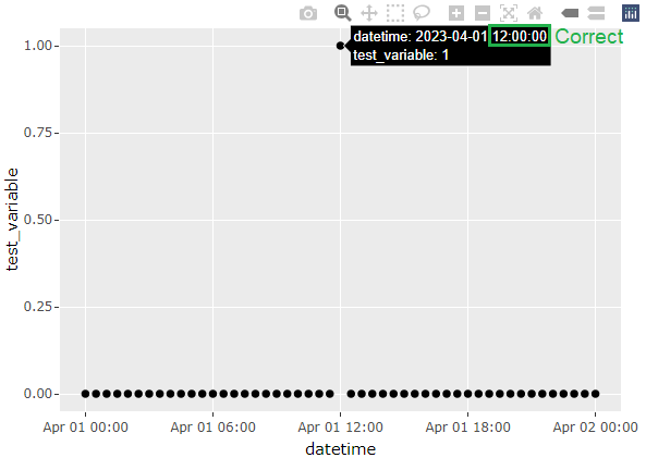
In the London time zone in BST period, the time displayed in the hover text is incorrect and is offset by one hour when converting a ggplot chart to Plotly. The issue is visible with bar chart and area chart, but not present with line chart and scatter plot. (Though I haven't tested all chart types so the issue could be more widespread.) The problem is present in plotly version 4.10.0 (ggplot2 version 3.6.6), but was not present in plotly version 4.9.3 (ggplot2 version 3.0.0).
library(ggplot2)
library(plotly)
library(lubridate)

Sys.setenv(TZ = "Europe/London")

datetime <- seq(ymd_hm("2023-04-01 00:00"), ymd_hm("2023-04-02 00:00"), by = "30 min")
df <- as.data.frame(datetime)
df$test_variable <- ifelse(df$datetime == ymd_hm("2023-04-01 12:00"), 1, 0)

#Line chart - no issue
ggplotly(
  ggplot(df, aes(datetime, test_variable)) +
    geom_line()
)

#Scatter plot - no issue
ggplotly(
  ggplot(df, aes(datetime, test_variable)) +
    geom_point()
)

#Bar chart - wrong time displayed
ggplotly(
  ggplot(df, aes(datetime, test_variable)) +
    geom_col()
)

#Area chart - wrong time displayed
ggplotly(
  ggplot(df, aes(datetime, test_variable)) +
    geom_area()
)



Beitragsleitfaden
Erste Schritte
- Lies das ganze Issue und danach den Beitragsleitfaden des Projekts.
- Schreib ins Issue, dass du es übernimmst — das erspart doppelte Arbeit.
- Forke das Repository und arbeite in einem Branch.
- Öffne einen Pull Request, der die Issue-Nummer nennt.
Rechercherichtung
Beginne mit der bereitgestellten R-Reproduktion unter Verwendung von Europe/London während BST und vergleiche die Ausgabe von ggplotly() für geom_col() und geom_area() mit Linien- und Streudiagrammen. Als erledigt gilt die Aufgabe, wenn der Hover-Text für die betroffenen Diagrammtypen die korrekte Ortszeit anzeigt, ohne Regressionen bei den Diagrammtypen zu verursachen, die bereits funktionieren.
Vom Indexierungsmodell aus dem Issue-Text verfasst.
Bewertung
- Tech-Stack
- r
- Bereich
- data-visualization
- Issue-Typ
- Bug
- Schwierigkeit
- 3/5
- Geschätzter Aufwand
- 1-2 Tage
- Aktivitätsstatus
- Veraltet
- Klarheit
- Größtenteils klar
- Anfängerfreundlichkeit
- 50/100