hline not rendering correct using ggplotly, geom_col, and stat_summary
オープン
まだ誰も着手していません。
- 主要言語
- R
- スター
- 2.7k
- フォーク
- 641
- PR マージ指標
- 30日以内にマージされた PR はありません
説明
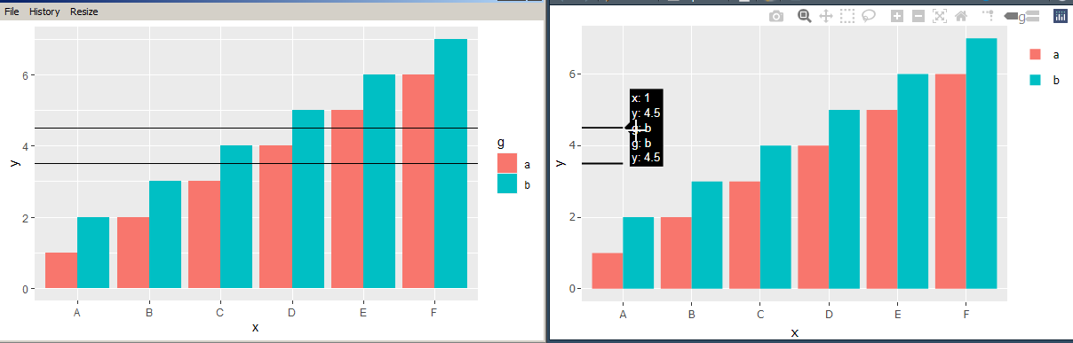
ggplotly does not render hline correctly across a geom_col, when using stat_summary.
ggplot draws the hline correctly across all x axis, but ggplotly cuts it off at first column. It should have hline across all x axis.
Thanks
library(ggplot2)
library(plotly)

df <- data.frame(x=LETTERS[1:6], y=c(1:6, 1:6 + 1), g=rep(x = c("a", "b"), each=6))

p<-ggplot(df, aes(x = x, y = y, fill = g, group = g)) +
  geom_col(position="dodge") + # geom_col is equivalent to geom_bar(stat = "identity")
  stat_summary(fun.y = mean, aes(x = 1, yintercept = ..y.., group = g), geom = "hline")

# This plot renders hline correctly across x axis
show(p)

#This plot does not render the hline across all x axis
p2<-ggplotly(p)
show(p2)
コントリビューションガイド
はじめの一歩
- issue を最後まで読み、次にプロジェクトのコントリビューションガイドを読みます。
- 着手することを issue にコメントします — 二人が同じ作業をするのを防げます。
- リポジトリをフォークし、ブランチを切って変更します。
- issue 番号を参照したプルリクエストを送ります。
調査の方向性
提供された R の再現例を、ggplot2、geom_col、stat_summary、ggplotly を使って開始し、ggplot のネイティブなレンダリングと変換後の出力を比較します。ggplotly で hline がどのように表現されているかを追跡し、提供された例で結果が x 軸のすべての列にわたっていることを確認します。
索引モデルが issue の本文から書いたものです。
評価
- 技術スタック
- r
- 領域
- data-visualization
- issue の種類
- バグ
- 難易度
- 4/5
- 見積もり時間
- 3〜5日
- 活発さ
- 停滞
- 明瞭さ
- おおむね明確
- 初心者へのやさしさ
- 35/100