hline not rendering correct using ggplotly, geom_col, and stat_summary
Open
Nobody has claimed this yet.
- Dominant language
- R
- Stars
- 2.7k
- Forks
- 641
- PR merge metrics
- No merged PRs in 30d
Description
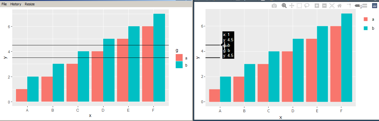
ggplotly does not render hline correctly across a geom_col, when using stat_summary.
ggplot draws the hline correctly across all x axis, but ggplotly cuts it off at first column. It should have hline across all x axis.
Thanks
library(ggplot2)
library(plotly)

df <- data.frame(x=LETTERS[1:6], y=c(1:6, 1:6 + 1), g=rep(x = c("a", "b"), each=6))

p<-ggplot(df, aes(x = x, y = y, fill = g, group = g)) +
  geom_col(position="dodge") + # geom_col is equivalent to geom_bar(stat = "identity")
  stat_summary(fun.y = mean, aes(x = 1, yintercept = ..y.., group = g), geom = "hline")

# This plot renders hline correctly across x axis
show(p)

#This plot does not render the hline across all x axis
p2<-ggplotly(p)
show(p2)
Contributor guide
First steps
- Read the whole issue, then the project's contributing guide.
- Comment on the issue to say you are picking it up — it saves two people doing the same work.
- Fork the repository and make your change on a branch.
- Open a pull request that references the issue number.
Research direction
Start with the provided R reproduction using ggplot2, geom_col, stat_summary, and ggplotly, comparing the native ggplot rendering with the converted output. Trace how the hline is represented in ggplotly and verify that the result spans all x-axis columns for the supplied example.
Written by the indexing model from the issue text.
Assessment
- Tech stack
- r
- Domain
- data-visualization
- Issue type
- Bug
- Difficulty
- 4/5
- Estimated time
- 3-5 days
- Activity status
- Stale
- Clarity
- Mostly clear
- Newbie friendliness
- 35/100