hline not rendering correct using ggplotly, geom_col, and stat_summary
未关闭
还没有人认领这个 Issue。
- 主要语言
- R
- 星标
- 2.7k
- 派生
- 641
- PR 合并指标
- 30 天内没有已合并 PR
描述
ggplotly does not render hline correctly across a geom_col, when using stat_summary.
ggplot draws the hline correctly across all x axis, but ggplotly cuts it off at first column. It should have hline across all x axis.
Thanks
library(ggplot2)
library(plotly)

df <- data.frame(x=LETTERS[1:6], y=c(1:6, 1:6 + 1), g=rep(x = c("a", "b"), each=6))

p<-ggplot(df, aes(x = x, y = y, fill = g, group = g)) +
  geom_col(position="dodge") + # geom_col is equivalent to geom_bar(stat = "identity")
  stat_summary(fun.y = mean, aes(x = 1, yintercept = ..y.., group = g), geom = "hline")

# This plot renders hline correctly across x axis
show(p)

#This plot does not render the hline across all x axis
p2<-ggplotly(p)
show(p2)
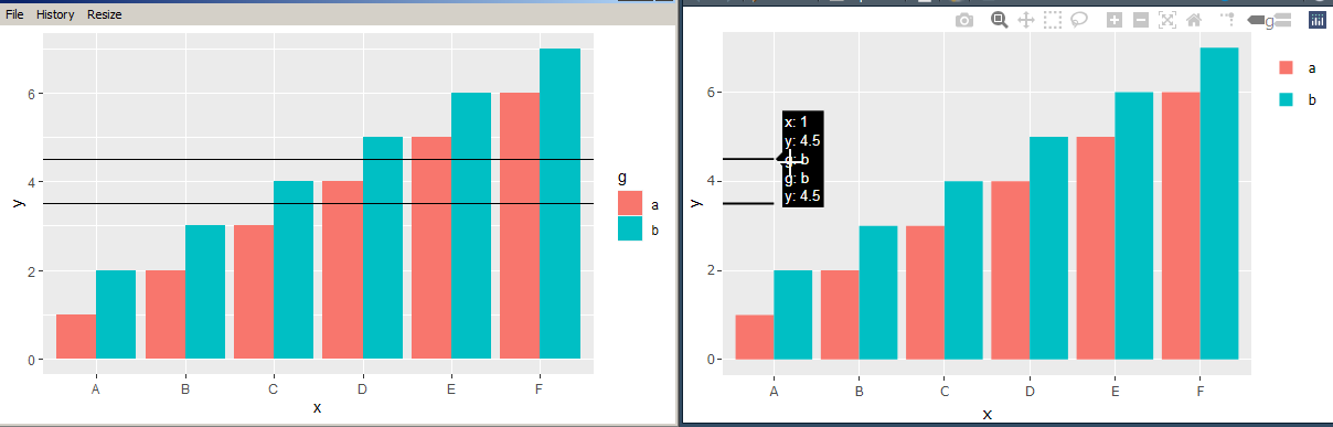
贡献指南
从这里开始
- 先读完整个 Issue,再读项目的贡献指南。
- 在 Issue 下留言说明你要接手 —— 这能避免两个人做同样的事。
- Fork 仓库,在一个分支上完成修改。
- 提交 Pull Request,并在描述里引用这个 Issue 编号。
调研方向
从提供的 R 复现开始,使用 ggplot2、geom_col、stat_summary 和 ggplotly,并将 ggplot 的原生渲染与转换后的输出进行比较。跟踪 hline 在 ggplotly 中的表示方式,并验证对于提供的示例,结果覆盖 x 轴的所有列。
由索引模型根据 Issue 内容生成。
评估
- 技术栈
- r
- 领域
- data-visualization
- Issue 类型
- 缺陷
- 难度
- 4/5
- 预计耗时
- 3-5 天
- 活跃度
- 停滞
- 描述清晰度
- 基本清楚
- 新手友好度
- 35/100