Visual artefacts on filled area plot + wrong axis on stackgroup
Chưa có ai nhận issue này.
- Ngôn ngữ chính
- JavaScript
- Star
- 18.3k
- Fork
- 2k
- Merge trung bình
- 2 ngày 12 giờ
- Pull request đã merge (30 ngày)
- 28
Mô tả
Hello!
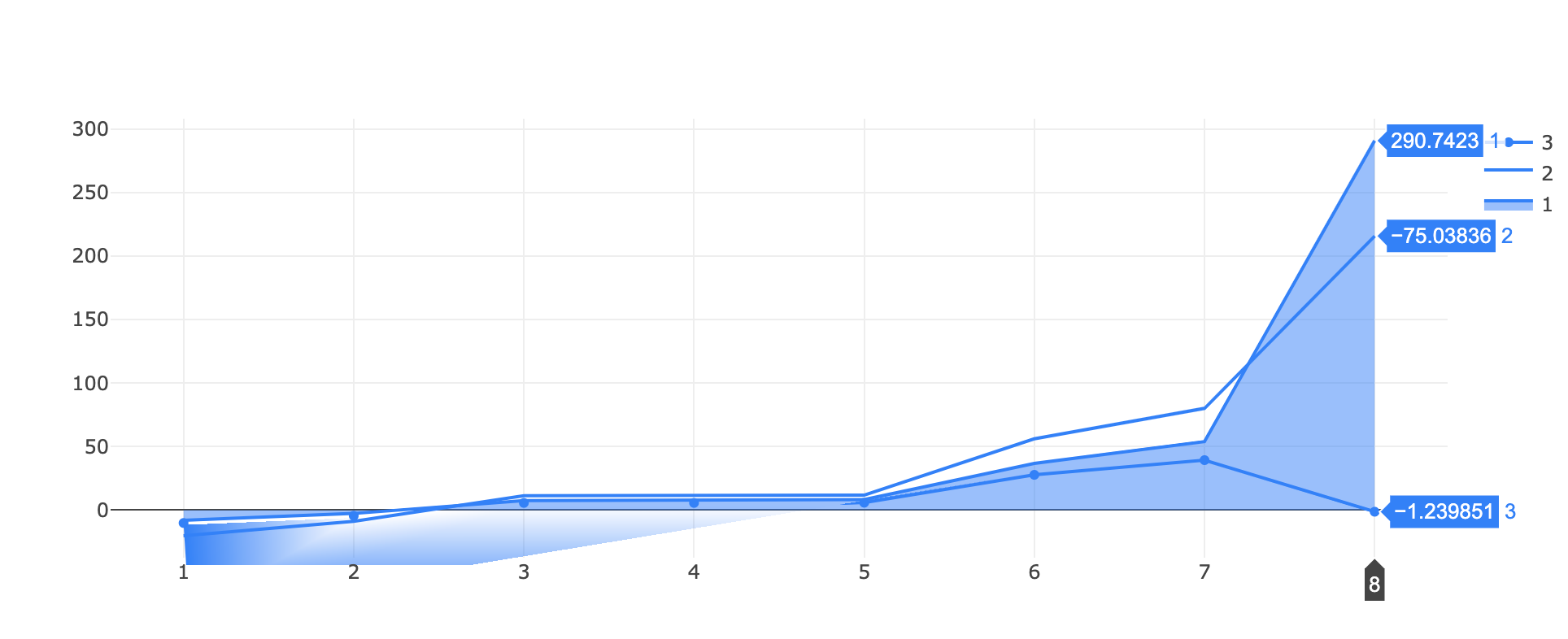
I've found a (two?) bug(s) while trying to visualize a filled area around a line!
I tested two approaches, one with stackgroups
https://jsfiddle.net/tuzqayeo/
var data = [
    {
      "x": [
        1,2,3,4,5,6,7,8
      ],
      "y": [
        -7.9697220089372856, -2.627365584280772, 7.593901896848809,
        7.593901896848809, 8.368216650109318, 36.78414802092127,
        53.936836616548824, 290.74225043249953
      ],
      "name": "1",
      "marker": { "color": "rgb(0,128,255)" },
      stackgroup: 'one',
      type: "scatter"
    },
    {
      "x": [
         1,2,3,4,5,6,7,8
      ],
      "y": [
        -12.176146295932956, -6.236001952326675, 3.815685614756825,3.815685614756825, 3.420446004767763, 19.39126823156141, 26.148107026147827, -75.03836092933072
      ],
      "name": "2",
      "marker": { "color": "rgb(0,128,255)" },
      stackgroup: 'one',
      fillcolor: "rgba(255,255,255,0)",
      type: "scatter"
    },
    {
      "x": [
         1,2,3,4,5,6,7,8
      ],
      "y": [
        -10.097532455267322, -4.448717940300206, 5.687911765670939,
        5.687911765670939, 5.86543013985068, 27.792147279053925,
        39.35149995881291, -1.239851028073491
      ],
      "name": "3",
      "marker": { "color": "rgb(0,128,255)" },
      "type": "scatter",
    }
  ];

var layout = {}

Plotly.newPlot('myDiv', data, layout);
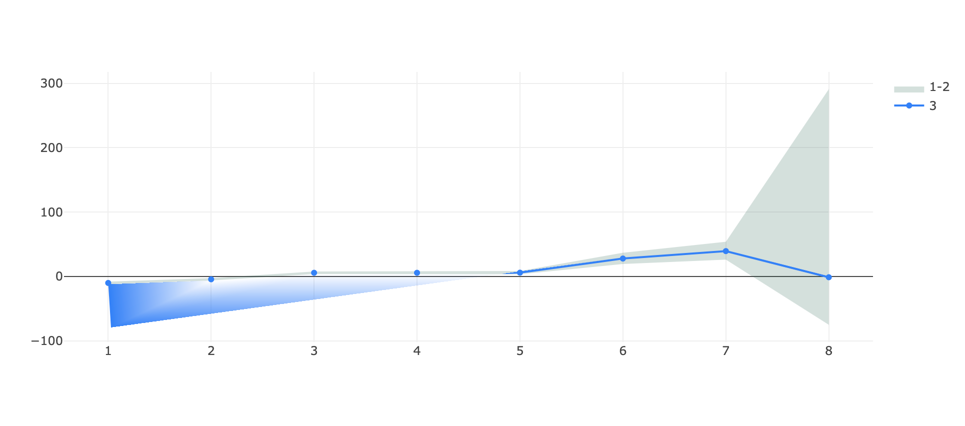
and one with a fill->toself line that wraps around itself:
https://jsfiddle.net/qocs8nxz/
var data = [
   {
      "x": [
         1,2,3,4,5,6,7,8,8,7,6,5,4,3,2,1
      ],
      "y": [
        -7.9697220089372856, -2.627365584280772, 7.593901896848809,
        7.593901896848809, 8.368216650109318, 36.78414802092127,
        53.936836616548824, 290.74225043249953, -75.03836092933072,
        26.148107026147827, 19.39126823156141, 3.420446004767763,
        3.815685614756825, 3.815685614756825, -6.236001952326675,
        -12.176146295932956
      ],
      "name": "1-2",
      "marker": { "color": "rgba(255,255,255,0)" },
      "type": "scatter",
      "fill": "toself",
      "fillcolor": "rgba(0,100,80,0.2)",
    },
    {
      "x": [
         1,2,3,4,5,6,7,8
      ],
      "y": [
        -10.097532455267322, -4.448717940300206, 5.687911765670939,
        5.687911765670939, 5.86543013985068, 27.792147279053925,
        39.35149995881291, -1.239851028073491
      ],
      "name": "3",
      "marker": { "color": "rgb(0,128,255)" },
      "type": "scatter",
    }
  ];

var layout = {}

Plotly.newPlot('myDiv', data, layout);
in both cases the HTML is simply
<head>
  <script src="https://cdn.plot.ly/plotly-latest.min.js"></script>
</head>

<body>
  <div id="myDiv"></div>
</body>
What I obtain in both cases is a visual artefact on the bottom at the start of the graph, the single line appears teared!
(in the first example there's also an issue of scale on the same y axis for the stacked group and the single line, where -75 is above -1 🤔)
It appears to be linked to the range of the graph since if I zoom vertically on a portion of the graph the issue disappear and even if I substitute the ~290 in each plot with like ~90 (so effectively decreasing the y range of the autorange plot) the issue disappear.
Let me know if more details are needed, any help is appreciated.
and with the scale reduced:

Hướng dẫn đóng góp
Bắt đầu từ đâu
- Đọc hết issue, rồi đọc hướng dẫn đóng góp của dự án.
- Bình luận trên issue rằng bạn sẽ nhận — tránh hai người làm cùng một việc.
- Fork repository và làm thay đổi trên một nhánh.
- Mở pull request có tham chiếu số hiệu của issue.
Hướng nghiên cứu
Tái hiện cả hai trường hợp jsfiddle được cung cấp thông qua Plotly.newPlot, trước tiên kiểm tra hiện tượng tạo tác của vùng được tô màu, sau đó kiểm tra tỷ lệ trục của stackgroup. So sánh hành vi khi phóng to theo chiều dọc và khi giảm các giá trị như mô tả. Hoàn tất khi các hiện tượng tạo tác biến mất và nhóm xếp chồng cùng đường đơn lẻ sử dụng chung tỷ lệ trục y chính xác trên các khoảng đã được báo cáo.
Do mô hình lập chỉ mục viết ra từ nội dung của issue.
Đánh giá
- Công nghệ
- javascript
- Lĩnh vực
- data-visualization
- Loại issue
- Lỗi
- Độ khó
- 4/5
- Thời gian dự kiến
- 3-5 ngày
- Mức độ hoạt động
- Đình trệ
- Độ rõ ràng
- Khá rõ ràng
- Mức phù hợp với người mới
- 35/100