Visual artefacts on filled area plot + wrong axis on stackgroup
Dieses Issue hat noch niemand übernommen.
- Vorherrschende Sprache
- JavaScript
- Sterne
- 18.3k
- Forks
- 2k
- Ø Merge
- 2 T. 12 Std.
- Gemergte PRs (30 T.)
- 28
Beschreibung
Hello!
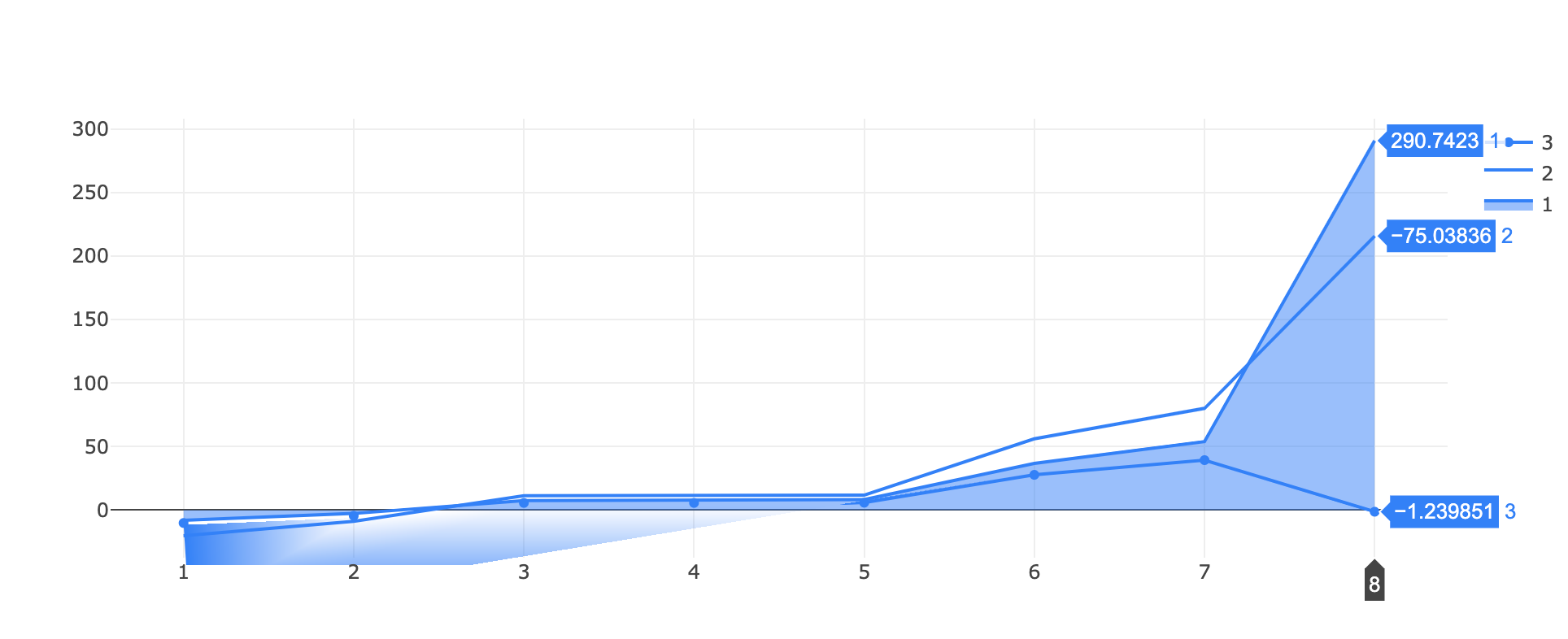
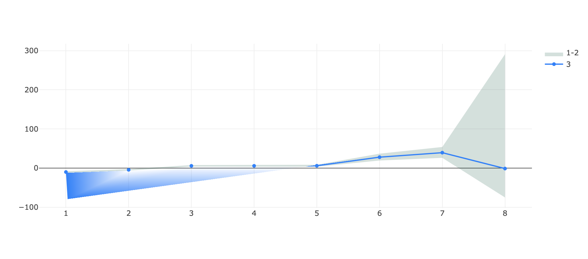
I've found a (two?) bug(s) while trying to visualize a filled area around a line!
I tested two approaches, one with stackgroups
https://jsfiddle.net/tuzqayeo/
var data = [
    {
      "x": [
        1,2,3,4,5,6,7,8
      ],
      "y": [
        -7.9697220089372856, -2.627365584280772, 7.593901896848809,
        7.593901896848809, 8.368216650109318, 36.78414802092127,
        53.936836616548824, 290.74225043249953
      ],
      "name": "1",
      "marker": { "color": "rgb(0,128,255)" },
      stackgroup: 'one',
      type: "scatter"
    },
    {
      "x": [
         1,2,3,4,5,6,7,8
      ],
      "y": [
        -12.176146295932956, -6.236001952326675, 3.815685614756825,3.815685614756825, 3.420446004767763, 19.39126823156141, 26.148107026147827, -75.03836092933072
      ],
      "name": "2",
      "marker": { "color": "rgb(0,128,255)" },
      stackgroup: 'one',
      fillcolor: "rgba(255,255,255,0)",
      type: "scatter"
    },
    {
      "x": [
         1,2,3,4,5,6,7,8
      ],
      "y": [
        -10.097532455267322, -4.448717940300206, 5.687911765670939,
        5.687911765670939, 5.86543013985068, 27.792147279053925,
        39.35149995881291, -1.239851028073491
      ],
      "name": "3",
      "marker": { "color": "rgb(0,128,255)" },
      "type": "scatter",
    }
  ];

var layout = {}

Plotly.newPlot('myDiv', data, layout);
and one with a fill->toself line that wraps around itself:
https://jsfiddle.net/qocs8nxz/
var data = [
   {
      "x": [
         1,2,3,4,5,6,7,8,8,7,6,5,4,3,2,1
      ],
      "y": [
        -7.9697220089372856, -2.627365584280772, 7.593901896848809,
        7.593901896848809, 8.368216650109318, 36.78414802092127,
        53.936836616548824, 290.74225043249953, -75.03836092933072,
        26.148107026147827, 19.39126823156141, 3.420446004767763,
        3.815685614756825, 3.815685614756825, -6.236001952326675,
        -12.176146295932956
      ],
      "name": "1-2",
      "marker": { "color": "rgba(255,255,255,0)" },
      "type": "scatter",
      "fill": "toself",
      "fillcolor": "rgba(0,100,80,0.2)",
    },
    {
      "x": [
         1,2,3,4,5,6,7,8
      ],
      "y": [
        -10.097532455267322, -4.448717940300206, 5.687911765670939,
        5.687911765670939, 5.86543013985068, 27.792147279053925,
        39.35149995881291, -1.239851028073491
      ],
      "name": "3",
      "marker": { "color": "rgb(0,128,255)" },
      "type": "scatter",
    }
  ];

var layout = {}

Plotly.newPlot('myDiv', data, layout);
in both cases the HTML is simply
<head>
  <script src="https://cdn.plot.ly/plotly-latest.min.js"></script>
</head>

<body>
  <div id="myDiv"></div>
</body>
What I obtain in both cases is a visual artefact on the bottom at the start of the graph, the single line appears teared!
(in the first example there's also an issue of scale on the same y axis for the stacked group and the single line, where -75 is above -1 🤔)
It appears to be linked to the range of the graph since if I zoom vertically on a portion of the graph the issue disappear and even if I substitute the ~290 in each plot with like ~90 (so effectively decreasing the y range of the autorange plot) the issue disappear.
Let me know if more details are needed, any help is appreciated.
and with the scale reduced:

Beitragsleitfaden
Erste Schritte
- Lies das ganze Issue und danach den Beitragsleitfaden des Projekts.
- Schreib ins Issue, dass du es übernimmst — das erspart doppelte Arbeit.
- Forke das Repository und arbeite in einem Branch.
- Öffne einen Pull Request, der die Issue-Nummer nennt.
Rechercherichtung
Reproduziere beide bereitgestellten jsfiddle-Fälle über Plotly.newPlot, indem du zuerst das Artefakt der ausgefüllten Fläche und anschließend die Achsenskalierung von stackgroup überprüfst. Vergleiche das Verhalten beim vertikalen Zoomen und mit reduzierten Werten wie beschrieben. Erledigt ist die Aufgabe, wenn die Artefakte verschwunden sind und die gestapelte Gruppe und die einzelne Linie über die gemeldeten Wertebereiche hinweg dieselbe korrekte y-Achsenskalierung verwenden.
Vom Indexierungsmodell aus dem Issue-Text verfasst.
Bewertung
- Tech-Stack
- javascript
- Bereich
- data-visualization
- Issue-Typ
- Bug
- Schwierigkeit
- 4/5
- Geschätzter Aufwand
- 3-5 Tage
- Aktivitätsstatus
- Veraltet
- Klarheit
- Größtenteils klar
- Anfängerfreundlichkeit
- 35/100