Visual artefacts on filled area plot + wrong axis on stackgroup
Personne n'a encore pris cette issue.
- Langage dominant
- JavaScript
- Étoiles
- 18.3k
- Forks
- 2k
- Merge moyen
- 2 j 12 h
- PR mergées (30 j)
- 28
Description
Hello!
I've found a (two?) bug(s) while trying to visualize a filled area around a line!
I tested two approaches, one with stackgroups
https://jsfiddle.net/tuzqayeo/
var data = [
    {
      "x": [
        1,2,3,4,5,6,7,8
      ],
      "y": [
        -7.9697220089372856, -2.627365584280772, 7.593901896848809,
        7.593901896848809, 8.368216650109318, 36.78414802092127,
        53.936836616548824, 290.74225043249953
      ],
      "name": "1",
      "marker": { "color": "rgb(0,128,255)" },
      stackgroup: 'one',
      type: "scatter"
    },
    {
      "x": [
         1,2,3,4,5,6,7,8
      ],
      "y": [
        -12.176146295932956, -6.236001952326675, 3.815685614756825,3.815685614756825, 3.420446004767763, 19.39126823156141, 26.148107026147827, -75.03836092933072
      ],
      "name": "2",
      "marker": { "color": "rgb(0,128,255)" },
      stackgroup: 'one',
      fillcolor: "rgba(255,255,255,0)",
      type: "scatter"
    },
    {
      "x": [
         1,2,3,4,5,6,7,8
      ],
      "y": [
        -10.097532455267322, -4.448717940300206, 5.687911765670939,
        5.687911765670939, 5.86543013985068, 27.792147279053925,
        39.35149995881291, -1.239851028073491
      ],
      "name": "3",
      "marker": { "color": "rgb(0,128,255)" },
      "type": "scatter",
    }
  ];

var layout = {}

Plotly.newPlot('myDiv', data, layout);
and one with a fill->toself line that wraps around itself:
https://jsfiddle.net/qocs8nxz/
var data = [
   {
      "x": [
         1,2,3,4,5,6,7,8,8,7,6,5,4,3,2,1
      ],
      "y": [
        -7.9697220089372856, -2.627365584280772, 7.593901896848809,
        7.593901896848809, 8.368216650109318, 36.78414802092127,
        53.936836616548824, 290.74225043249953, -75.03836092933072,
        26.148107026147827, 19.39126823156141, 3.420446004767763,
        3.815685614756825, 3.815685614756825, -6.236001952326675,
        -12.176146295932956
      ],
      "name": "1-2",
      "marker": { "color": "rgba(255,255,255,0)" },
      "type": "scatter",
      "fill": "toself",
      "fillcolor": "rgba(0,100,80,0.2)",
    },
    {
      "x": [
         1,2,3,4,5,6,7,8
      ],
      "y": [
        -10.097532455267322, -4.448717940300206, 5.687911765670939,
        5.687911765670939, 5.86543013985068, 27.792147279053925,
        39.35149995881291, -1.239851028073491
      ],
      "name": "3",
      "marker": { "color": "rgb(0,128,255)" },
      "type": "scatter",
    }
  ];

var layout = {}

Plotly.newPlot('myDiv', data, layout);
in both cases the HTML is simply
<head>
  <script src="https://cdn.plot.ly/plotly-latest.min.js"></script>
</head>

<body>
  <div id="myDiv"></div>
</body>
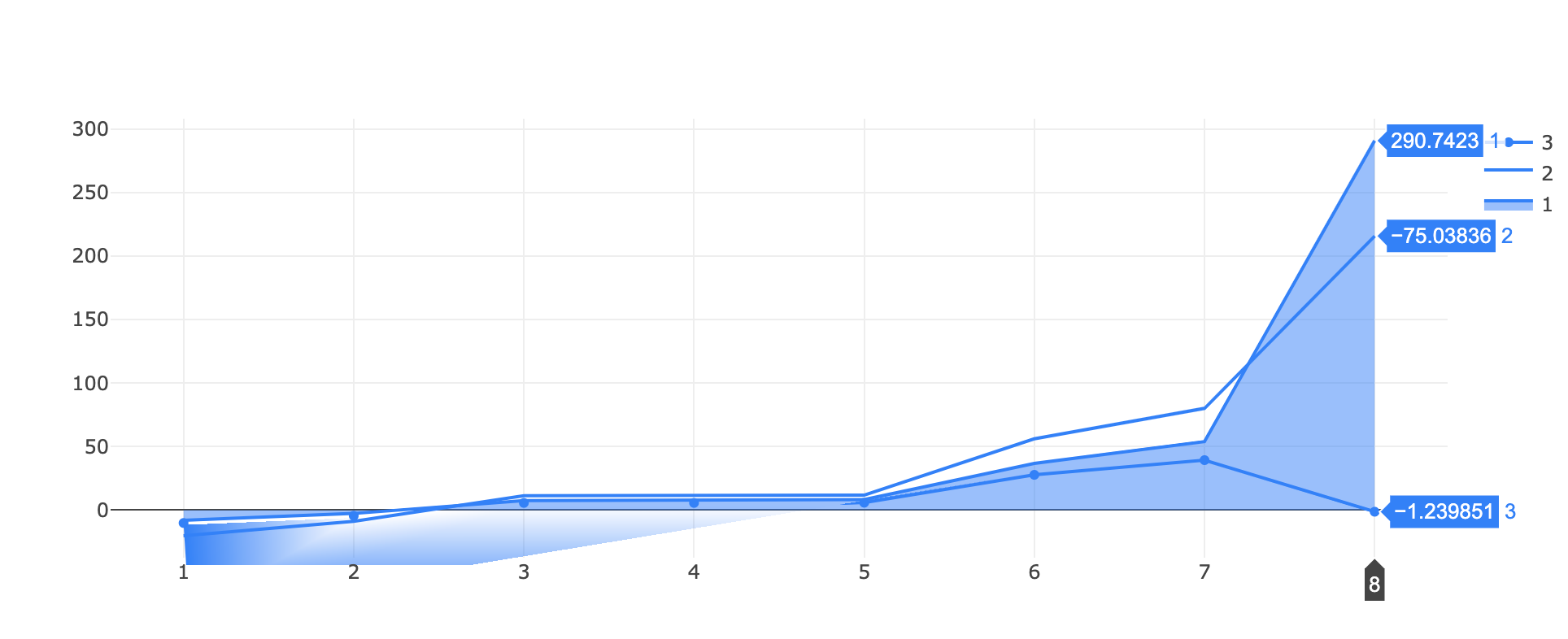
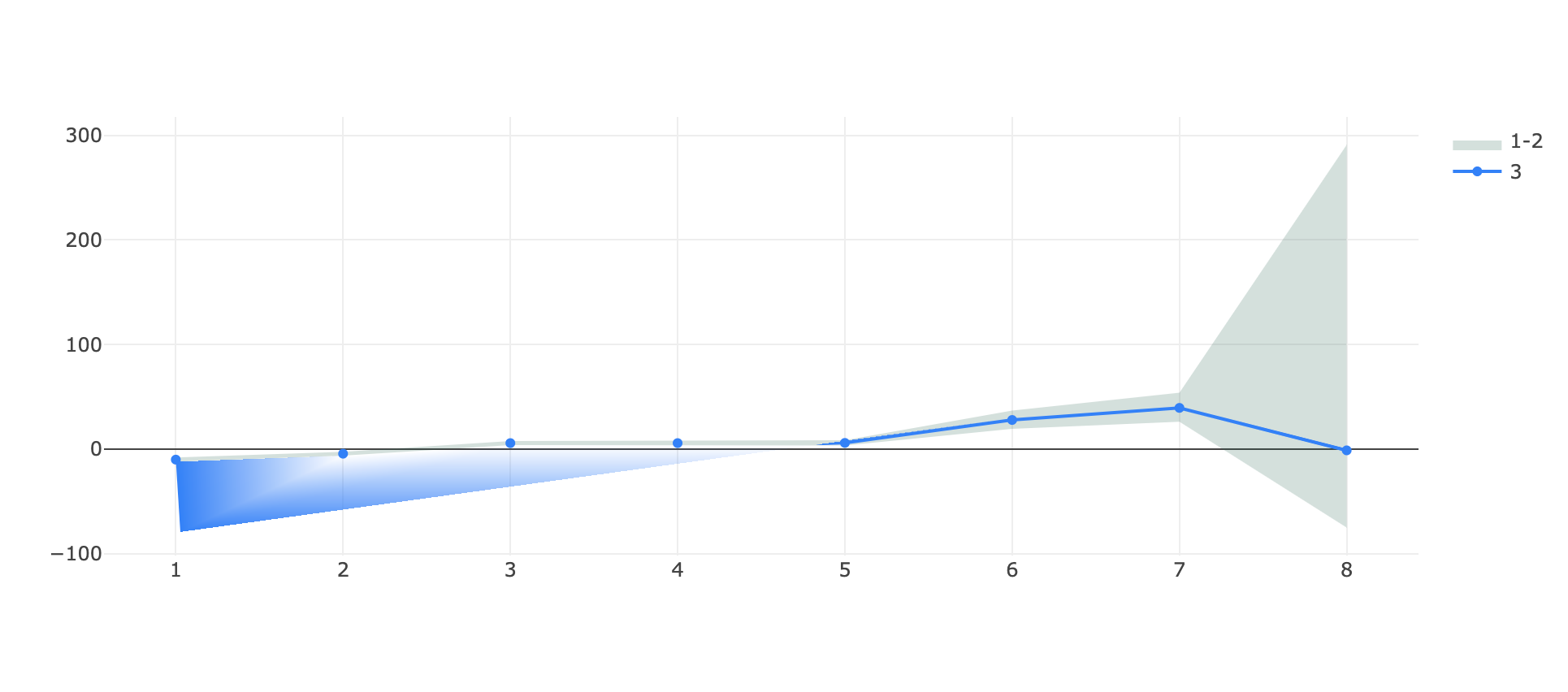
What I obtain in both cases is a visual artefact on the bottom at the start of the graph, the single line appears teared!
(in the first example there's also an issue of scale on the same y axis for the stacked group and the single line, where -75 is above -1 🤔)
It appears to be linked to the range of the graph since if I zoom vertically on a portion of the graph the issue disappear and even if I substitute the ~290 in each plot with like ~90 (so effectively decreasing the y range of the autorange plot) the issue disappear.
Let me know if more details are needed, any help is appreciated.
and with the scale reduced:

Guide de contribution
Ouvrir le guide de contribution
Par où commencer
- Lisez l'issue en entier, puis le guide de contribution du projet.
- Signalez en commentaire que vous la prenez — cela évite que deux personnes fassent le même travail.
- Forkez le dépôt et travaillez sur une branche.
- Ouvrez une pull request qui référence le numéro de l'issue.
Piste de recherche
Reproduire les deux cas jsfiddle fournis via Plotly.newPlot, en vérifiant d’abord l’artefact de la zone remplie, puis l’échelle de l’axe de stackgroup. Comparer le comportement avec un zoom vertical et avec des valeurs réduites comme décrit. La tâche est terminée lorsque les artefacts ont disparu et que le groupe empilé et la ligne unique partagent la bonne échelle de l’axe y sur l’ensemble des plages signalées.
Rédigé par le modèle d'indexation à partir du texte de l'issue.
Évaluation
- Stack technique
- javascript
- Domaine
- data-visualization
- Type d'issue
- Bug
- Difficulté
- 4/5
- Temps estimé
- 3-5 jours
- Activité
- À l'abandon
- Clarté
- Plutôt claire
- Accessibilité débutants
- 35/100