Issues with legend position, in particular since update 4.10
Chưa có ai nhận issue này.
- Ngôn ngữ chính
- R
- Star
- 2.7k
- Fork
- 641
- Chỉ số merge pull request
- Không có pull request nào được merge trong 30 ngày
Mô tả
Hey,
it's been a while I am struggling with the position of the legend in plotly. First, let me report a small bug, then I'll ask another question.
Reprex: execute the following code with plotly 4.9.4.1 and 4.10, respectively. You'll see that the legend holds on one line in 4.9.4.1 vs. two lines in 4.10 (cf. figures below).
bars <- plot_ly(x = .5, y = "foo", type = 'bar', orientation = 'h', name="First color of legend") %>% # , marker = list(color = 'red', line = list(color = 'white')
  layout(barmode = 'stack', margin = list(t = 50), showlegend = T,
         legend = list(orientation='h', y=1.2, x=0.2, traceorder='normal', font=list(size=12, color='black'))) %>%
  add_trace(x = .5, name="Second color of legend")
bars
orca(bars, width = 415, height = 150, file = "temp.png")
4.9.4.1
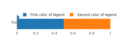
4.10
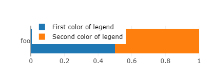
I had optimized hundreds of images with the old version, so I'll just keep the old version running, to avoid having to manually adjust hundreds of width parameters. It may seem an innocuous change for people who start creating their figures with the last version (4.10). But actually it forces to create wider figures if one wants to keep the legend in one line. This in turn widens the relative size of the bar to the detriment of the label (foo), thus rendering the label text smaller (and less readable) when one embeds this figure in a document (with width constrained to text width). Also, notice a related bug: for some widths values close to the switch between one line and two lines legend, the size of the bar reduces for no reason. This offsets the legend from the bar and ends up in an ugly plot.
I could solve my bug by using the old package, so I don't really mind. But as I am here, I'd like to know if there is some way to automatize the positioning of the legend and the width of the figures.
My issue is that I am creating hundreds of figures to plot survey results, variable by variable (see e.g. here). I have created a semi-automatized function that takes to plot a variable in a bar chart like the one above, but I still need to find manually the minimum width such that the legend holds in one line (and doesn't mask the bar), which is quite cumbersome. Another thing that I'd like to automatize is the placement of the legend: I'd like it to be the furthest possible to the left (again, to minimize width), and this depends on the size of the labels.
Are there ways to automatize the placement of the legend's "x" as well as the width with which to save the graph? Or more generally, is there a function to nicely plot a factor variable in a bar chart, by just giving the variable and the function automatically adjusts the parameters to make a nice plot?
Hướng dẫn đóng góp
Bắt đầu từ đâu
- Đọc hết issue, rồi đọc hướng dẫn đóng góp của dự án.
- Bình luận trên issue rằng bạn sẽ nhận — tránh hai người làm cùng một việc.
- Fork repository và làm thay đổi trên một nhánh.
- Mở pull request có tham chiếu số hiệu của issue.
Hướng nghiên cứu
Bắt đầu bằng cách chạy trình tái hiện R được cung cấp với plotly 4.9.4.1 và 4.10, rồi so sánh việc ngắt dòng của chú giải, kích thước thanh và vị trí ở các độ rộng gần nhau. Được xem là hoàn tất khi hồi quy đã được giải thích hoặc khắc phục, đồng thời vị trí của chú giải và hành vi về độ rộng đã được xác minh dựa trên các ví dụ được báo cáo.
Do mô hình lập chỉ mục viết ra từ nội dung của issue.
Đánh giá
- Công nghệ
- r
- Lĩnh vực
- data-visualization
- Loại issue
- Lỗi
- Độ khó
- 4/5
- Thời gian dự kiến
- 3-5 ngày
- Mức độ hoạt động
- Đình trệ
- Độ rõ ràng
- Khá rõ ràng
- Mức phù hợp với người mới
- 25/100