Issues with legend position, in particular since update 4.10
Dieses Issue hat noch niemand übernommen.
- Vorherrschende Sprache
- R
- Sterne
- 2.7k
- Forks
- 641
- PR-Merge-Kennzahlen
- Keine gemergten PRs in 30 T.
Beschreibung
Hey,
it's been a while I am struggling with the position of the legend in plotly. First, let me report a small bug, then I'll ask another question.
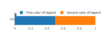
Reprex: execute the following code with plotly 4.9.4.1 and 4.10, respectively. You'll see that the legend holds on one line in 4.9.4.1 vs. two lines in 4.10 (cf. figures below).
bars <- plot_ly(x = .5, y = "foo", type = 'bar', orientation = 'h', name="First color of legend") %>% # , marker = list(color = 'red', line = list(color = 'white')
  layout(barmode = 'stack', margin = list(t = 50), showlegend = T,
         legend = list(orientation='h', y=1.2, x=0.2, traceorder='normal', font=list(size=12, color='black'))) %>%
  add_trace(x = .5, name="Second color of legend")
bars
orca(bars, width = 415, height = 150, file = "temp.png")
4.9.4.1
4.10
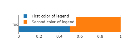
I had optimized hundreds of images with the old version, so I'll just keep the old version running, to avoid having to manually adjust hundreds of width parameters. It may seem an innocuous change for people who start creating their figures with the last version (4.10). But actually it forces to create wider figures if one wants to keep the legend in one line. This in turn widens the relative size of the bar to the detriment of the label (foo), thus rendering the label text smaller (and less readable) when one embeds this figure in a document (with width constrained to text width). Also, notice a related bug: for some widths values close to the switch between one line and two lines legend, the size of the bar reduces for no reason. This offsets the legend from the bar and ends up in an ugly plot.
I could solve my bug by using the old package, so I don't really mind. But as I am here, I'd like to know if there is some way to automatize the positioning of the legend and the width of the figures.
My issue is that I am creating hundreds of figures to plot survey results, variable by variable (see e.g. here). I have created a semi-automatized function that takes to plot a variable in a bar chart like the one above, but I still need to find manually the minimum width such that the legend holds in one line (and doesn't mask the bar), which is quite cumbersome. Another thing that I'd like to automatize is the placement of the legend: I'd like it to be the furthest possible to the left (again, to minimize width), and this depends on the size of the labels.
Are there ways to automatize the placement of the legend's "x" as well as the width with which to save the graph? Or more generally, is there a function to nicely plot a factor variable in a bar chart, by just giving the variable and the function automatically adjusts the parameters to make a nice plot?
Beitragsleitfaden
Erste Schritte
- Lies das ganze Issue und danach den Beitragsleitfaden des Projekts.
- Schreib ins Issue, dass du es übernimmst — das erspart doppelte Arbeit.
- Forke das Repository und arbeite in einem Branch.
- Öffne einen Pull Request, der die Issue-Nummer nennt.
Rechercherichtung
Beginne damit, den mitgelieferten R-Reproducer mit plotly 4.9.4.1 und 4.10 auszuführen, und vergleiche das Umbrechen der Legende, die Balkengröße und die Platzierung bei benachbarten Breiten. Als erledigt gilt die Aufgabe, wenn die Regression erklärt oder korrigiert wurde und die Positionierung der Legende sowie das Breitenverhalten anhand der gemeldeten Beispiele überprüft wurden.
Vom Indexierungsmodell aus dem Issue-Text verfasst.
Bewertung
- Tech-Stack
- r
- Bereich
- data-visualization
- Issue-Typ
- Bug
- Schwierigkeit
- 4/5
- Geschätzter Aufwand
- 3-5 Tage
- Aktivitätsstatus
- Veraltet
- Klarheit
- Größtenteils klar
- Anfängerfreundlichkeit
- 25/100