Issues with legend position, in particular since update 4.10
还没有人认领这个 Issue。
- 主要语言
- R
- 星标
- 2.7k
- 派生
- 641
- PR 合并指标
- 30 天内没有已合并 PR
描述
Hey,
it's been a while I am struggling with the position of the legend in plotly. First, let me report a small bug, then I'll ask another question.
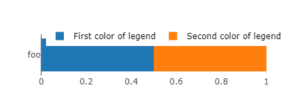
Reprex: execute the following code with plotly 4.9.4.1 and 4.10, respectively. You'll see that the legend holds on one line in 4.9.4.1 vs. two lines in 4.10 (cf. figures below).
bars <- plot_ly(x = .5, y = "foo", type = 'bar', orientation = 'h', name="First color of legend") %>% # , marker = list(color = 'red', line = list(color = 'white')
  layout(barmode = 'stack', margin = list(t = 50), showlegend = T,
         legend = list(orientation='h', y=1.2, x=0.2, traceorder='normal', font=list(size=12, color='black'))) %>%
  add_trace(x = .5, name="Second color of legend")
bars
orca(bars, width = 415, height = 150, file = "temp.png")
4.9.4.1
4.10
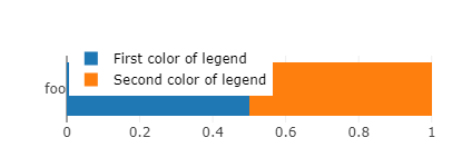
I had optimized hundreds of images with the old version, so I'll just keep the old version running, to avoid having to manually adjust hundreds of width parameters. It may seem an innocuous change for people who start creating their figures with the last version (4.10). But actually it forces to create wider figures if one wants to keep the legend in one line. This in turn widens the relative size of the bar to the detriment of the label (foo), thus rendering the label text smaller (and less readable) when one embeds this figure in a document (with width constrained to text width). Also, notice a related bug: for some widths values close to the switch between one line and two lines legend, the size of the bar reduces for no reason. This offsets the legend from the bar and ends up in an ugly plot.
I could solve my bug by using the old package, so I don't really mind. But as I am here, I'd like to know if there is some way to automatize the positioning of the legend and the width of the figures.
My issue is that I am creating hundreds of figures to plot survey results, variable by variable (see e.g. here). I have created a semi-automatized function that takes to plot a variable in a bar chart like the one above, but I still need to find manually the minimum width such that the legend holds in one line (and doesn't mask the bar), which is quite cumbersome. Another thing that I'd like to automatize is the placement of the legend: I'd like it to be the furthest possible to the left (again, to minimize width), and this depends on the size of the labels.
Are there ways to automatize the placement of the legend's "x" as well as the width with which to save the graph? Or more generally, is there a function to nicely plot a factor variable in a bar chart, by just giving the variable and the function automatically adjusts the parameters to make a nice plot?
贡献指南
从这里开始
- 先读完整个 Issue,再读项目的贡献指南。
- 在 Issue 下留言说明你要接手 —— 这能避免两个人做同样的事。
- Fork 仓库,在一个分支上完成修改。
- 提交 Pull Request,并在描述里引用这个 Issue 编号。
调研方向
首先使用 plotly 4.9.4.1 和 4.10 运行随附的 R 复现程序,并比较相近宽度下图例的换行、条形大小和位置。完成的标准是已解释或修正该回归问题,并根据报告中的示例验证图例位置和宽度行为。
由索引模型根据 Issue 内容生成。
评估
- 技术栈
- r
- 领域
- data-visualization
- Issue 类型
- 缺陷
- 难度
- 4/5
- 预计耗时
- 3-5 天
- 活跃度
- 停滞
- 描述清晰度
- 基本清楚
- 新手友好度
- 25/100