Issues with legend position, in particular since update 4.10
まだ誰も着手していません。
- 主要言語
- R
- スター
- 2.7k
- フォーク
- 641
- PR マージ指標
- 30日以内にマージされた PR はありません
説明
Hey,
it's been a while I am struggling with the position of the legend in plotly. First, let me report a small bug, then I'll ask another question.
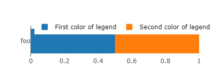
Reprex: execute the following code with plotly 4.9.4.1 and 4.10, respectively. You'll see that the legend holds on one line in 4.9.4.1 vs. two lines in 4.10 (cf. figures below).
bars <- plot_ly(x = .5, y = "foo", type = 'bar', orientation = 'h', name="First color of legend") %>% # , marker = list(color = 'red', line = list(color = 'white')
  layout(barmode = 'stack', margin = list(t = 50), showlegend = T,
         legend = list(orientation='h', y=1.2, x=0.2, traceorder='normal', font=list(size=12, color='black'))) %>%
  add_trace(x = .5, name="Second color of legend")
bars
orca(bars, width = 415, height = 150, file = "temp.png")
4.9.4.1
4.10
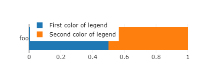
I had optimized hundreds of images with the old version, so I'll just keep the old version running, to avoid having to manually adjust hundreds of width parameters. It may seem an innocuous change for people who start creating their figures with the last version (4.10). But actually it forces to create wider figures if one wants to keep the legend in one line. This in turn widens the relative size of the bar to the detriment of the label (foo), thus rendering the label text smaller (and less readable) when one embeds this figure in a document (with width constrained to text width). Also, notice a related bug: for some widths values close to the switch between one line and two lines legend, the size of the bar reduces for no reason. This offsets the legend from the bar and ends up in an ugly plot.
I could solve my bug by using the old package, so I don't really mind. But as I am here, I'd like to know if there is some way to automatize the positioning of the legend and the width of the figures.
My issue is that I am creating hundreds of figures to plot survey results, variable by variable (see e.g. here). I have created a semi-automatized function that takes to plot a variable in a bar chart like the one above, but I still need to find manually the minimum width such that the legend holds in one line (and doesn't mask the bar), which is quite cumbersome. Another thing that I'd like to automatize is the placement of the legend: I'd like it to be the furthest possible to the left (again, to minimize width), and this depends on the size of the labels.
Are there ways to automatize the placement of the legend's "x" as well as the width with which to save the graph? Or more generally, is there a function to nicely plot a factor variable in a bar chart, by just giving the variable and the function automatically adjusts the parameters to make a nice plot?
コントリビューションガイド
はじめの一歩
- issue を最後まで読み、次にプロジェクトのコントリビューションガイドを読みます。
- 着手することを issue にコメントします — 二人が同じ作業をするのを防げます。
- リポジトリをフォークし、ブランチを切って変更します。
- issue 番号を参照したプルリクエストを送ります。
調査の方向性
まず、提供されている R 再現コードを plotly 4.9.4.1 と 4.10 で実行し、近接する幅における凡例の折り返し、バーのサイズ、配置を比較します。回帰の原因が説明されるか修正され、報告された例に対して凡例の配置と幅の挙動が検証されれば完了です。
索引モデルが issue の本文から書いたものです。
評価
- 技術スタック
- r
- 領域
- data-visualization
- issue の種類
- バグ
- 難易度
- 4/5
- 見積もり時間
- 3〜5日
- 活発さ
- 停滞
- 明瞭さ
- おおむね明確
- 初心者へのやさしさ
- 25/100