Quantile lines on violin plots are not rendered
オープン
まだ誰も着手していません。
ggplotly
- 主要言語
- R
- スター
- 2.7k
- フォーク
- 641
- PR マージ指標
- 30日以内にマージされた PR はありません
説明
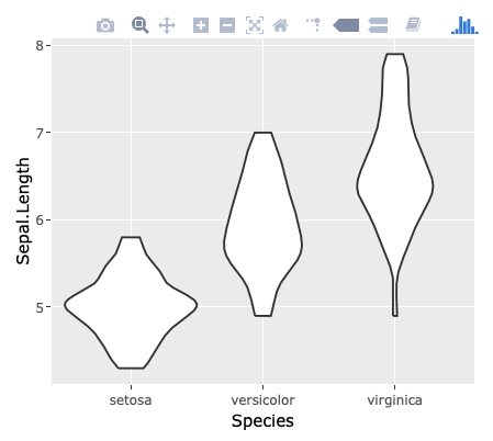
When using draw_quantiles argument of ggplot2::geom_violin and converting the result with plotly::ggplotly, the quantile lines are shown on ggplot but not on plotly.
library(ggplot2)
library(plotly)
#>
#> Attaching package: 'plotly'
#> The following object is masked from 'package:ggplot2':
#>
#>     last_plot
#> The following object is masked from 'package:stats':
#>
#>     filter
#> The following object is masked from 'package:graphics':
#>
#>     layout

g <- ggplot(iris, aes(Species, Sepal.Length)) +
  geom_violin(draw_quantiles = c(0.25, 0.5, 0.75))
g

# ggplotly(g)
Created on 2018-11-12 by the reprex package (v0.2.1)
I'm not able to provided the result of ggplotly above. Still, by executing ggplotly(g) above, you'll find that the quantile lines disappear:
コントリビューションガイド
はじめの一歩
- issue を最後まで読み、次にプロジェクトのコントリビューションガイドを読みます。
- 着手することを issue にコメントします — 二人が同じ作業をするのを防げます。
- リポジトリをフォークし、ブランチを切って変更します。
- issue 番号を参照したプルリクエストを送ります。
調査の方向性
提供された R の例を使用し、ggplot2::geom_violin(draw_quantiles = c(0.25, 0.5, 0.75)) と plotly::ggplotly を使って問題を再現します。バイオリンレイヤーとその分位点線がどのように変換されるかを追跡し、その後、変換後のプロットに分位点線が ggplot と同じように表示されることを確認します。
索引モデルが issue の本文から書いたものです。
評価
- 技術スタック
- r
- 領域
- data-visualization
- issue の種類
- バグ
- 難易度
- 3/5
- 見積もり時間
- 1〜2日
- 活発さ
- 停滞
- 明瞭さ
- 明確に書かれている
- 初心者へのやさしさ
- 45/100