Quantile lines on violin plots are not rendered
未关闭
还没有人认领这个 Issue。
ggplotly
- 主要语言
- R
- 星标
- 2.7k
- 派生
- 641
- PR 合并指标
- 30 天内没有已合并 PR
描述
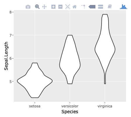
When using draw_quantiles argument of ggplot2::geom_violin and converting the result with plotly::ggplotly, the quantile lines are shown on ggplot but not on plotly.
library(ggplot2)
library(plotly)
#>
#> Attaching package: 'plotly'
#> The following object is masked from 'package:ggplot2':
#>
#>     last_plot
#> The following object is masked from 'package:stats':
#>
#>     filter
#> The following object is masked from 'package:graphics':
#>
#>     layout

g <- ggplot(iris, aes(Species, Sepal.Length)) +
  geom_violin(draw_quantiles = c(0.25, 0.5, 0.75))
g

# ggplotly(g)
Created on 2018-11-12 by the reprex package (v0.2.1)
I'm not able to provided the result of ggplotly above. Still, by executing ggplotly(g) above, you'll find that the quantile lines disappear:
贡献指南
从这里开始
- 先读完整个 Issue,再读项目的贡献指南。
- 在 Issue 下留言说明你要接手 —— 这能避免两个人做同样的事。
- Fork 仓库,在一个分支上完成修改。
- 提交 Pull Request,并在描述里引用这个 Issue 编号。
调研方向
使用提供的 R 示例,通过 ggplot2::geom_violin(draw_quantiles = c(0.25, 0.5, 0.75)) 和 plotly::ggplotly 重现该问题。跟踪小提琴图层及其分位数线的转换过程,然后验证转换后的图中是否像 ggplot 中一样显示分位数线。
由索引模型根据 Issue 内容生成。
评估
- 技术栈
- r
- 领域
- data-visualization
- Issue 类型
- 缺陷
- 难度
- 3/5
- 预计耗时
- 1-2 天
- 活跃度
- 停滞
- 描述清晰度
- 描述清楚
- 新手友好度
- 45/100