Quantile lines on violin plots are not rendered
Open
Nobody has claimed this yet.
ggplotly
- Dominant language
- R
- Stars
- 2.7k
- Forks
- 641
- PR merge metrics
- No merged PRs in 30d
Description
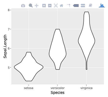
When using draw_quantiles argument of ggplot2::geom_violin and converting the result with plotly::ggplotly, the quantile lines are shown on ggplot but not on plotly.
library(ggplot2)
library(plotly)
#>
#> Attaching package: 'plotly'
#> The following object is masked from 'package:ggplot2':
#>
#>     last_plot
#> The following object is masked from 'package:stats':
#>
#>     filter
#> The following object is masked from 'package:graphics':
#>
#>     layout

g <- ggplot(iris, aes(Species, Sepal.Length)) +
  geom_violin(draw_quantiles = c(0.25, 0.5, 0.75))
g

# ggplotly(g)
Created on 2018-11-12 by the reprex package (v0.2.1)
I'm not able to provided the result of ggplotly above. Still, by executing ggplotly(g) above, you'll find that the quantile lines disappear:
Contributor guide
First steps
- Read the whole issue, then the project's contributing guide.
- Comment on the issue to say you are picking it up — it saves two people doing the same work.
- Fork the repository and make your change on a branch.
- Open a pull request that references the issue number.
Research direction
Reproduce the issue with the supplied R example using ggplot2::geom_violin(draw_quantiles = c(0.25, 0.5, 0.75)) and plotly::ggplotly. Trace how violin layers and their quantile lines are converted, then verify that the quantile lines appear in the converted plot as they do in ggplot.
Written by the indexing model from the issue text.
Assessment
- Tech stack
- r
- Domain
- data-visualization
- Issue type
- Bug
- Difficulty
- 3/5
- Estimated time
- 1-2 days
- Activity status
- Stale
- Clarity
- Clearly specified
- Newbie friendliness
- 45/100