Flexible connected overlay has incorrect position on Mobile
- Ngôn ngữ chính
- TypeScript
- Star
- 25k
- Fork
- 6.8k
- Merge trung bình
- 1 ngày 8 giờ
- Pull request đã merge (30 ngày)
- 91
Mô tả
#### What is the expected behavior?
The flexible connected overlay should appear near the origin on Mobile browsers with custom viewport:
``
#### What is the current behavior?
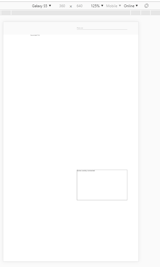
The overlay appears on the bottom of the screen
Reproducible at least on:
- Chrome for Android
- Chrome for Windows (with device toolbar enabled, Device type = Mobile)
- Safari on IPhone
#### What are the steps to reproduce?
https://stackblitz.com/edit/angular-9bewwa-k9rrhg
1. Open example in new window
2. Open dev tools
3. Toggle device toolbar
4. Select some mobile phone in portrait mode
5. Click on input
Actual result: Overlay appears on the bottom of the screen
Expected result: Overlay appears under the input
#### Which versions of Angular, Material, OS, TypeScript, browsers are affected?
Angular: latest
Material: latest
OS: Windows, Android, IOS
Browsers: Chrome, Safari
#### Is there anything else we should know?
Hướng dẫn đóng góp
Hướng nghiên cứu
Bắt đầu với bản tái hiện StackBlitz được liên kết và tái hiện vị trí của overlay bằng viewport tùy chỉnh được cung cấp trên Chrome hoặc Safari trong điều kiện di động. Theo dõi hành vi định vị linh hoạt của overlay được kết nối được sử dụng sau khi nhấp vào input; hoàn tất khi overlay xuất hiện bên dưới hoặc gần input thay vì ở cuối màn hình.
Do mô hình lập chỉ mục viết ra từ nội dung của issue.
Đánh giá
- Công nghệ
- angular, typescript
- Lĩnh vực
- frontend, mobile
- Loại issue
- Lỗi
- Độ khó
- 4/5
- Thời gian dự kiến
- 3-5 ngày
- Mức độ hoạt động
- Đình trệ
- Độ rõ ràng
- Khá rõ ràng
- Mức phù hợp với người mới
- 35/100