Flexible connected overlay has incorrect position on Mobile
- 主要言語
- TypeScript
- スター
- 25k
- フォーク
- 6.8k
- 平均マージ
- 1日 8時間
- マージ済み PR(30日)
- 91
説明
#### What is the expected behavior?
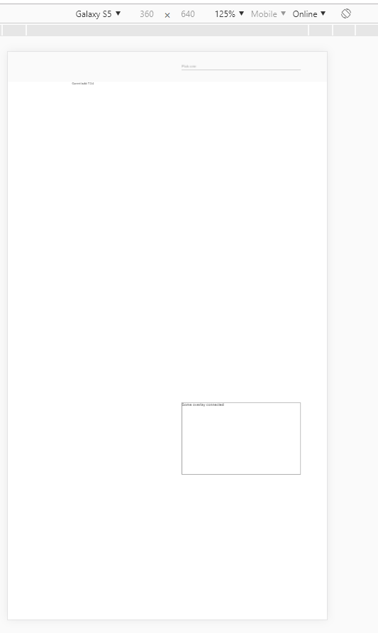
The flexible connected overlay should appear near the origin on Mobile browsers with custom viewport:
``
#### What is the current behavior?
The overlay appears on the bottom of the screen
Reproducible at least on:
- Chrome for Android
- Chrome for Windows (with device toolbar enabled, Device type = Mobile)
- Safari on IPhone
#### What are the steps to reproduce?
https://stackblitz.com/edit/angular-9bewwa-k9rrhg
1. Open example in new window
2. Open dev tools
3. Toggle device toolbar
4. Select some mobile phone in portrait mode
5. Click on input
Actual result: Overlay appears on the bottom of the screen
Expected result: Overlay appears under the input
#### Which versions of Angular, Material, OS, TypeScript, browsers are affected?
Angular: latest
Material: latest
OS: Windows, Android, IOS
Browsers: Chrome, Safari
#### Is there anything else we should know?
コントリビューションガイド
調査の方向性
リンクされている StackBlitz の再現から始め、提供されたカスタム viewport を使用して、Chrome または Safari のモバイル条件で overlay の位置を再現します。input をクリックした後に使用される、接続された overlay の柔軟な位置決め動作を追跡します。完了条件は、overlay が画面下部ではなく input の下またはその付近に表示されることです。
索引モデルが issue の本文から書いたものです。
評価
- 技術スタック
- angular, typescript
- 領域
- frontend, mobile
- issue の種類
- バグ
- 難易度
- 4/5
- 見積もり時間
- 3〜5日
- 活発さ
- 停滞
- 明瞭さ
- おおむね明確
- 初心者へのやさしさ
- 35/100