Flexible connected overlay has incorrect position on Mobile
- Langage dominant
- TypeScript
- Étoiles
- 25k
- Forks
- 6.8k
- Merge moyen
- 1 j 8 h
- PR mergées (30 j)
- 91
Description
#### What is the expected behavior?
The flexible connected overlay should appear near the origin on Mobile browsers with custom viewport:
``
#### What is the current behavior?
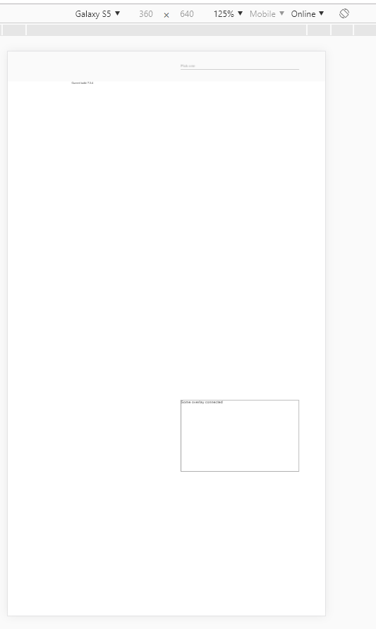
The overlay appears on the bottom of the screen
Reproducible at least on:
- Chrome for Android
- Chrome for Windows (with device toolbar enabled, Device type = Mobile)
- Safari on IPhone
#### What are the steps to reproduce?
https://stackblitz.com/edit/angular-9bewwa-k9rrhg
1. Open example in new window
2. Open dev tools
3. Toggle device toolbar
4. Select some mobile phone in portrait mode
5. Click on input
Actual result: Overlay appears on the bottom of the screen
Expected result: Overlay appears under the input
#### Which versions of Angular, Material, OS, TypeScript, browsers are affected?
Angular: latest
Material: latest
OS: Windows, Android, IOS
Browsers: Chrome, Safari
#### Is there anything else we should know?
Guide de contribution
Ouvrir le guide de contribution
Piste de recherche
Commencez par la reproduction StackBlitz liée et reproduisez la position de l'overlay à l'aide du viewport personnalisé fourni dans Chrome ou Safari en conditions mobiles. Suivez le comportement flexible de positionnement de l'overlay connecté utilisé après avoir cliqué sur l'input ; le travail est terminé lorsque l'overlay apparaît sous l'input ou à proximité, plutôt qu'en bas de l'écran.
Rédigé par le modèle d'indexation à partir du texte de l'issue.
Évaluation
- Stack technique
- angular, typescript
- Domaine
- frontend, mobile
- Type d'issue
- Bug
- Difficulté
- 4/5
- Temps estimé
- 3-5 jours
- Activité
- À l'abandon
- Clarté
- Plutôt claire
- Accessibilité débutants
- 35/100