Flexible connected overlay has incorrect position on Mobile
- Lingua principale
- TypeScript
- Stelle
- 25k
- Fork
- 6.8k
- Merge medio
- 1g 8h
- PR unite (30g)
- 91
Descrizione
#### What is the expected behavior?
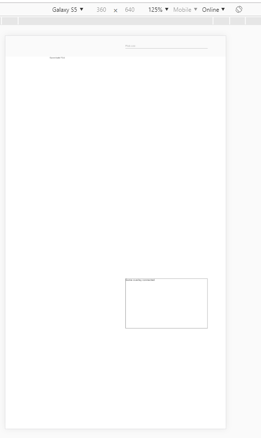
The flexible connected overlay should appear near the origin on Mobile browsers with custom viewport:
``
#### What is the current behavior?
The overlay appears on the bottom of the screen
Reproducible at least on:
- Chrome for Android
- Chrome for Windows (with device toolbar enabled, Device type = Mobile)
- Safari on IPhone
#### What are the steps to reproduce?
https://stackblitz.com/edit/angular-9bewwa-k9rrhg
1. Open example in new window
2. Open dev tools
3. Toggle device toolbar
4. Select some mobile phone in portrait mode
5. Click on input
Actual result: Overlay appears on the bottom of the screen
Expected result: Overlay appears under the input
#### Which versions of Angular, Material, OS, TypeScript, browsers are affected?
Angular: latest
Material: latest
OS: Windows, Android, IOS
Browsers: Chrome, Safari
#### Is there anything else we should know?
Guida per i contributori
Apri la guida per i contributori
Direzione di ricerca
Inizia con la riproduzione StackBlitz collegata e riproduci la posizione dell'overlay usando il viewport personalizzato fornito su Chrome o Safari in condizioni mobile. Traccia il comportamento flessibile di posizionamento dell'overlay connesso usato dopo aver fatto clic sull'input; il lavoro è completato quando l'overlay appare sotto l'input o nelle sue vicinanze invece che nella parte inferiore dello schermo.
Scritto dal modello di indicizzazione a partire dal testo della issue.
Valutazione
- Stack tecnologico
- angular, typescript
- Ambito
- frontend, mobile
- Tipo di issue
- Bug
- Difficoltà
- 4/5
- Tempo stimato
- 3-5 giorni
- Stato di attività
- Ferma
- Chiarezza
- Abbastanza chiara
- Idoneità per principianti
- 35/100