stacked bar chart does not display text when colour is supplied
オープン
まだ誰も着手していません。
- 主要言語
- R
- スター
- 2.7k
- フォーク
- 641
- PR マージ指標
- 30日以内にマージされた PR はありません
説明
or vice versa - color attribute is ignored
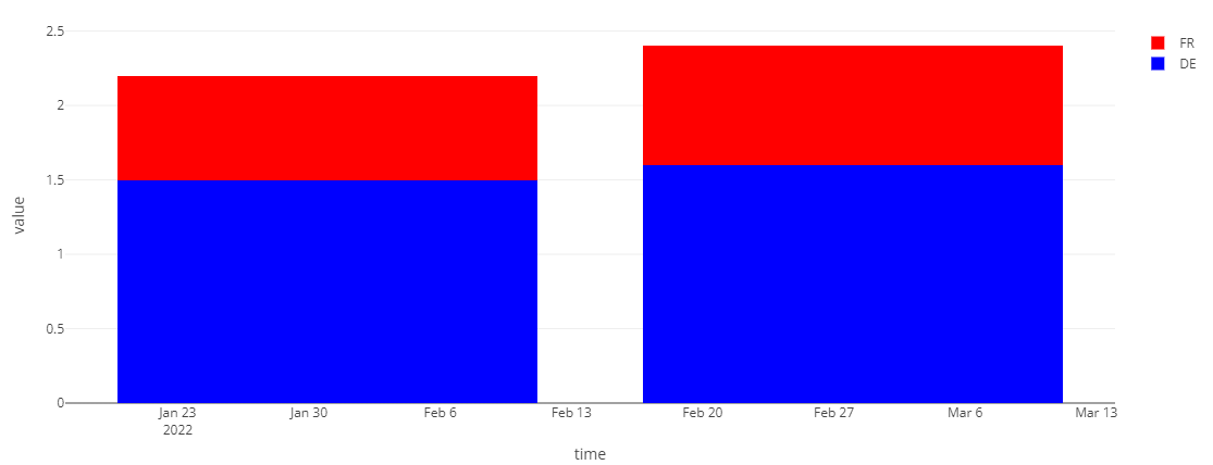
I would like to have stacked bar chart with specific colours & labels for each value, but in current setting color is ignored or the text labels disappear:
library(data.table)
library(plotly)

x <- structure(
  list(time = structure(c(19023, 19023, 19051, 19051), class = "Date"),
       group = structure(c(2L, 1L, 2L, 1L), levels = c("FR", "DE"),
                     class = c("ordered", "factor")),
       value = c(1.5, 0.7, 1.6, 0.8)), row.names = c(NA, -4L),
  class = c("data.table", "data.frame"))
x

my_col <- c('red', 'blue')

plot_ly(x, x = ~time, y = ~value, type = 'bar'
        , name = ~group
        , colors = my_col # ignored
        , text = ~ value, textposition = 'auto'
        ) %>% layout(barmode = 'stack')

# when adding color we lose text:
plot_ly(x, x = ~time, y = ~value, type = 'bar'
        , name = ~group
        , color = ~group
        , colors = my_col
        , text = ~ value, textposition = 'auto'
        ) %>% layout(barmode = 'stack')
# text isnt visiable

plot_ly(x, x = ~time, y = ~value, type = 'bar'
        , color = ~group
        , colors = my_col
        , text = ~ value, textposition = 'auto'
) %>% layout(barmode = 'stack')
# text isnt visiable
コントリビューションガイド
はじめの一歩
- issue を最後まで読み、次にプロジェクトのコントリビューションガイドを読みます。
- 着手することを issue にコメントします — 二人が同じ作業をするのを防げます。
- リポジトリをフォークし、ブランチを切って変更します。
- issue 番号を参照したプルリクエストを送ります。
調査の方向性
issue にある積み上げ棒グラフの例を plotly.R で再現し、指定した色とテキストラベルを比較する。まず、R plotly API が積み上げ棒グラフの色とテキストをどのように扱うかを追跡する。完了条件は、要求された色と値ラベルの両方が同時に表示されたままになること。
索引モデルが issue の本文から書いたものです。
評価
- 技術スタック
- r
- 領域
- data-visualization
- issue の種類
- バグ
- 難易度
- 3/5
- 見積もり時間
- 1〜2日
- 活発さ
- 停滞
- 明瞭さ
- おおむね明確
- 初心者へのやさしさ
- 45/100