Issue with log scale displaying floating point numbers when on x axis.
未关闭
还没有人认领这个 Issue。
- 主要语言
- R
- 星标
- 2.7k
- 派生
- 641
- PR 合并指标
- 30 天内没有已合并 PR
描述
The log scale should display rounded integers, but is displaying floating points with many decimal places. Seems to be fine though when the log scale is on the y axis. Also does not happen all the time. Works for another graph I have.
Brief description of the problem
library(plotly)
library(tibble)


# fake data
df <- tibble(geog_area = letters[1:10],
             value = runif(10, 100, 100000))

plot_ly() %>%
  add_trace(data = df,
            x = ~value,
            y = ~geog_area,
            type = 'bar',
            hovertemplate = paste("%{x:,.0f}")) %>%
  layout(xaxis = list(tickformat = ",",
                      type = "log"),
         yaxis = list(title = "",
                      autorange = "reversed"),
         barmode = 'stack',
         hovermode = 'y unified') %>%
  hide_legend()
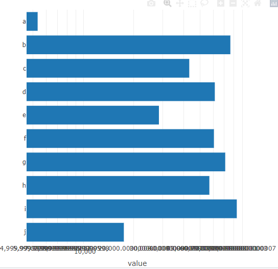
> sessionInfo()
R version 4.0.3 (2020-10-10)
Platform: x86_64-pc-linux-gnu (64-bit)
Running under: Ubuntu 18.04.5 LTS

Matrix products: default
BLAS:   /usr/lib/x86_64-linux-gnu/blas/libblas.so.3.7.1
LAPACK: /usr/lib/x86_64-linux-gnu/lapack/liblapack.so.3.7.1

locale:
 [1] LC_CTYPE=C.UTF-8       LC_NUMERIC=C           LC_TIME=C.UTF-8        LC_COLLATE=C.UTF-8     LC_MONETARY=C.UTF-8    LC_MESSAGES=C.UTF-8    LC_PAPER=C.UTF-8
 [8] LC_NAME=C              LC_ADDRESS=C           LC_TELEPHONE=C         LC_MEASUREMENT=C.UTF-8 LC_IDENTIFICATION=C

attached base packages:
[1] stats     graphics  grDevices utils     datasets  methods   base

other attached packages:
[1] tibble_3.1.0   plotly_4.9.4.1 ggplot2_3.3.3

loaded via a namespace (and not attached):
 [1] pillar_1.5.0      compiler_4.0.3    tools_4.0.3       digest_0.6.27     packrat_0.5.0     jsonlite_1.7.2    lifecycle_1.0.0   gtable_0.3.0      viridisLite_0.3.0
[10] pkgconfig_2.0.3   rlang_0.4.10      DBI_1.1.1         crosstalk_1.1.1   yaml_2.2.1        withr_2.4.2       dplyr_1.0.4       httr_1.4.2        generics_0.1.0
[19] vctrs_0.3.6       htmlwidgets_1.5.3 grid_4.0.3        tidyselect_1.1.0  glue_1.4.2        data.table_1.12.8 R6_2.5.0          fansi_0.4.2       purrr_0.3.4
[28] tidyr_1.1.3       blob_1.2.1        magrittr_2.0.1    scales_1.1.1      ellipsis_0.3.1    htmltools_0.5.1.1 assertthat_0.2.1  colorspace_2.0-0  utf8_1.1.4
[37] lazyeval_0.2.2    munsell_0.5.0     crayon_1.4.1
贡献指南
从这里开始
- 先读完整个 Issue,再读项目的贡献指南。
- 在 Issue 下留言说明你要接手 —— 这能避免两个人做同样的事。
- Fork 仓库,在一个分支上完成修改。
- 提交 Pull Request,并在描述里引用这个 Issue 编号。
调研方向
首先使用 plotly 4.9.4.1 运行提供的 R 示例,并将 x 轴对数刻度的格式与 y 轴的情况进行比较。跟踪相关 plotly.R 和 JavaScript 路径中对数轴和 tickformat 的处理;完成标准是可复现的 x 轴对数图表显示经过舍入的整数刻度,同时不使 y 轴行为发生回归。
由索引模型根据 Issue 内容生成。
评估
- 技术栈
- d3js, javascript, r
- 领域
- data-visualization
- Issue 类型
- 缺陷
- 难度
- 4/5
- 预计耗时
- 3-5 天
- 活跃度
- 停滞
- 描述清晰度
- 基本清楚
- 新手友好度
- 35/100