Issue with log scale displaying floating point numbers when on x axis.
Open
Nobody has claimed this yet.
- Dominant language
- R
- Stars
- 2.7k
- Forks
- 641
- PR merge metrics
- No merged PRs in 30d
Description
The log scale should display rounded integers, but is displaying floating points with many decimal places. Seems to be fine though when the log scale is on the y axis. Also does not happen all the time. Works for another graph I have.
Brief description of the problem
library(plotly)
library(tibble)


# fake data
df <- tibble(geog_area = letters[1:10],
             value = runif(10, 100, 100000))

plot_ly() %>%
  add_trace(data = df,
            x = ~value,
            y = ~geog_area,
            type = 'bar',
            hovertemplate = paste("%{x:,.0f}")) %>%
  layout(xaxis = list(tickformat = ",",
                      type = "log"),
         yaxis = list(title = "",
                      autorange = "reversed"),
         barmode = 'stack',
         hovermode = 'y unified') %>%
  hide_legend()
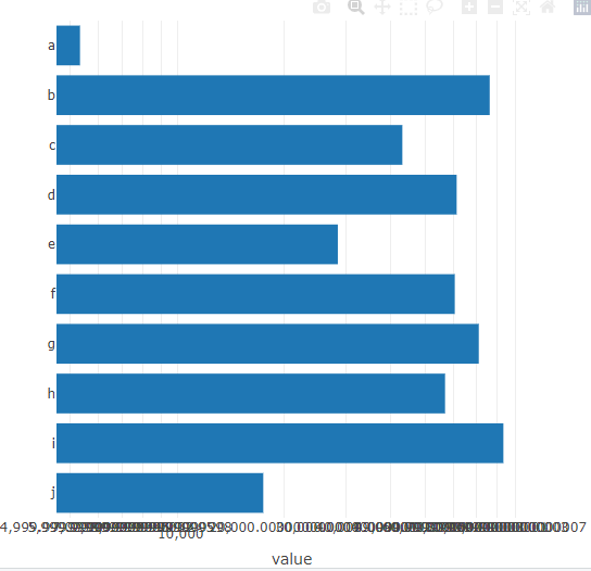
> sessionInfo()
R version 4.0.3 (2020-10-10)
Platform: x86_64-pc-linux-gnu (64-bit)
Running under: Ubuntu 18.04.5 LTS

Matrix products: default
BLAS:   /usr/lib/x86_64-linux-gnu/blas/libblas.so.3.7.1
LAPACK: /usr/lib/x86_64-linux-gnu/lapack/liblapack.so.3.7.1

locale:
 [1] LC_CTYPE=C.UTF-8       LC_NUMERIC=C           LC_TIME=C.UTF-8        LC_COLLATE=C.UTF-8     LC_MONETARY=C.UTF-8    LC_MESSAGES=C.UTF-8    LC_PAPER=C.UTF-8
 [8] LC_NAME=C              LC_ADDRESS=C           LC_TELEPHONE=C         LC_MEASUREMENT=C.UTF-8 LC_IDENTIFICATION=C

attached base packages:
[1] stats     graphics  grDevices utils     datasets  methods   base

other attached packages:
[1] tibble_3.1.0   plotly_4.9.4.1 ggplot2_3.3.3

loaded via a namespace (and not attached):
 [1] pillar_1.5.0      compiler_4.0.3    tools_4.0.3       digest_0.6.27     packrat_0.5.0     jsonlite_1.7.2    lifecycle_1.0.0   gtable_0.3.0      viridisLite_0.3.0
[10] pkgconfig_2.0.3   rlang_0.4.10      DBI_1.1.1         crosstalk_1.1.1   yaml_2.2.1        withr_2.4.2       dplyr_1.0.4       httr_1.4.2        generics_0.1.0
[19] vctrs_0.3.6       htmlwidgets_1.5.3 grid_4.0.3        tidyselect_1.1.0  glue_1.4.2        data.table_1.12.8 R6_2.5.0          fansi_0.4.2       purrr_0.3.4
[28] tidyr_1.1.3       blob_1.2.1        magrittr_2.0.1    scales_1.1.1      ellipsis_0.3.1    htmltools_0.5.1.1 assertthat_0.2.1  colorspace_2.0-0  utf8_1.1.4
[37] lazyeval_0.2.2    munsell_0.5.0     crayon_1.4.1
Contributor guide
First steps
- Read the whole issue, then the project's contributing guide.
- Comment on the issue to say you are picking it up — it saves two people doing the same work.
- Fork the repository and make your change on a branch.
- Open a pull request that references the issue number.
Research direction
Start by running the supplied R example with plotly 4.9.4.1 and compare x-axis log tick formatting with the y-axis case. Trace the log-axis and tickformat handling in the relevant plotly.R and JavaScript paths; done means reproducible x-axis log charts display rounded integer ticks without regressing y-axis behavior.
Written by the indexing model from the issue text.
Assessment
- Tech stack
- d3js, javascript, r
- Domain
- data-visualization
- Issue type
- Bug
- Difficulty
- 4/5
- Estimated time
- 3-5 days
- Activity status
- Stale
- Clarity
- Mostly clear
- Newbie friendliness
- 35/100