Flexible connected overlay has incorrect position on Mobile
- Dominant language
- TypeScript
- Stars
- 25k
- Forks
- 6.8k
- Avg merge
- 1d 8h
- Merged PRs (30d)
- 91
Description
#### What is the expected behavior?
The flexible connected overlay should appear near the origin on Mobile browsers with custom viewport:
``
#### What is the current behavior?
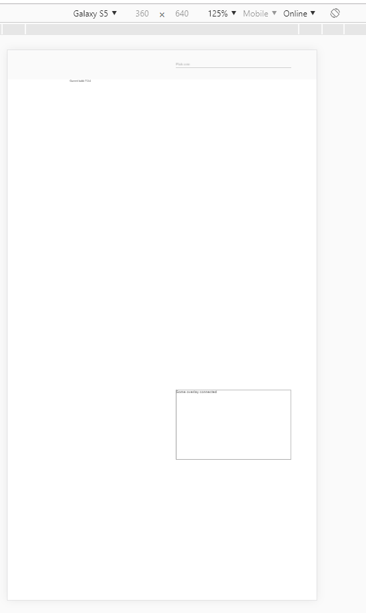
The overlay appears on the bottom of the screen
Reproducible at least on:
- Chrome for Android
- Chrome for Windows (with device toolbar enabled, Device type = Mobile)
- Safari on IPhone
#### What are the steps to reproduce?
https://stackblitz.com/edit/angular-9bewwa-k9rrhg
1. Open example in new window
2. Open dev tools
3. Toggle device toolbar
4. Select some mobile phone in portrait mode
5. Click on input
Actual result: Overlay appears on the bottom of the screen
Expected result: Overlay appears under the input
#### Which versions of Angular, Material, OS, TypeScript, browsers are affected?
Angular: latest
Material: latest
OS: Windows, Android, IOS
Browsers: Chrome, Safari
#### Is there anything else we should know?
Contributor guide
Research direction
Start with the linked StackBlitz reproduction and reproduce the overlay position using the supplied custom viewport on Chrome or Safari mobile conditions. Trace the flexible connected overlay positioning behavior used after clicking the input; done means the overlay appears under or near the input rather than at the bottom of the screen.
Written by the indexing model from the issue text.
Assessment
- Tech stack
- angular, typescript
- Domain
- frontend, mobile
- Issue type
- Bug
- Difficulty
- 4/5
- Estimated time
- 3-5 days
- Activity status
- Stale
- Clarity
- Mostly clear
- Newbie friendliness
- 35/100