Icon styles are inconsistent
- 主要言語
- Python
- スター
- 1.2k
- フォーク
- 131
- 平均マージ
- 1日 11時間
- マージ済み PR(30日)
- 14
説明
Sometimes we use colorful, shaded style icons:
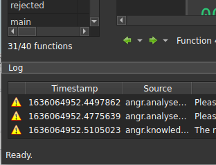
Other times we use "modern" flat, single color icons:

---
For reference, Ida uses the former approach:

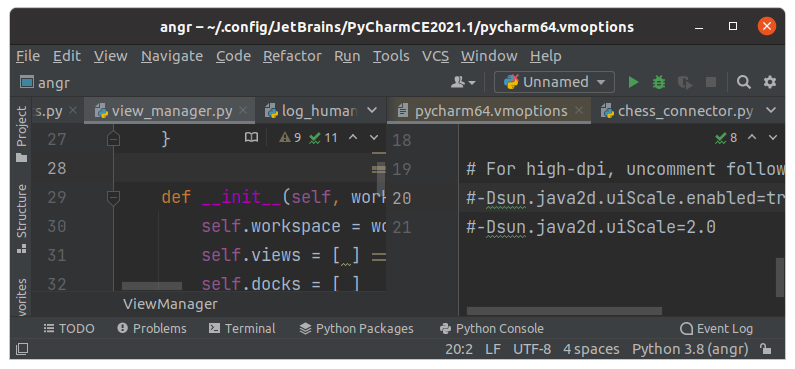
Some tools like PyCharm use flat icons, sometimes with color:
---
Personally I don't have a strong feeling one way or the other, but we should pick a style and be consistent. The latter approach has the benefit of using font-based icon sets which have many usable ones ready to go and we don't have to worry too much about design.
コントリビューションガイド
このリポジトリのコントリビューションガイドは索引されていません
評価
この issue はまだ評価されていません。