Icon styles are inconsistent
- Lingua principale
- Python
- Stelle
- 1.2k
- Fork
- 131
- Merge medio
- 1g 11h
- PR unite (30g)
- 14
Descrizione
Sometimes we use colorful, shaded style icons:
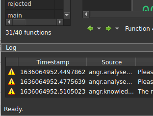
Other times we use "modern" flat, single color icons:

---
For reference, Ida uses the former approach:

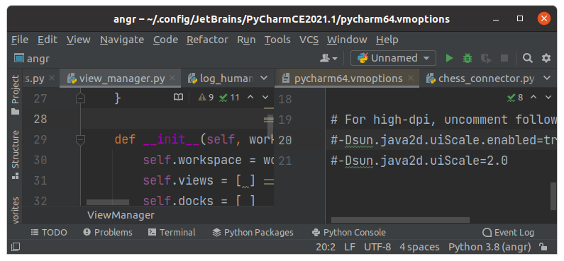
Some tools like PyCharm use flat icons, sometimes with color:
---
Personally I don't have a strong feeling one way or the other, but we should pick a style and be consistent. The latter approach has the benefit of using font-based icon sets which have many usable ones ready to go and we don't have to worry too much about design.
Guida per i contributori
Nessuna guida per i contributori indicizzata per questo repository
Valutazione
Questa issue non è ancora stata valutata.