Icon styles are inconsistent
- Vorherrschende Sprache
- Python
- Sterne
- 1.2k
- Forks
- 131
- Ø Merge
- 1 T. 11 Std.
- Gemergte PRs (30 T.)
- 14
Beschreibung
Sometimes we use colorful, shaded style icons:
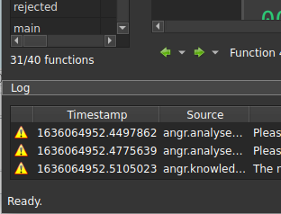
Other times we use "modern" flat, single color icons:

---
For reference, Ida uses the former approach:

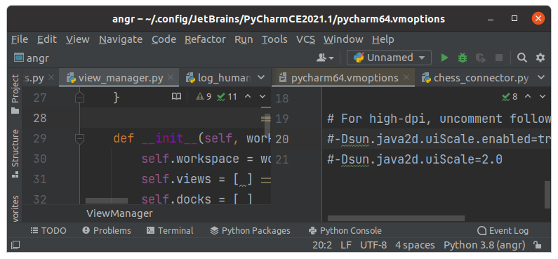
Some tools like PyCharm use flat icons, sometimes with color:
---
Personally I don't have a strong feeling one way or the other, but we should pick a style and be consistent. The latter approach has the benefit of using font-based icon sets which have many usable ones ready to go and we don't have to worry too much about design.
Beitragsleitfaden
Für dieses Repository ist kein Beitragsleitfaden indexiert
Bewertung
Dieses Issue wurde noch nicht bewertet.