Pie Chart Misalignment Issue when resizing the browser window
Nobody has claimed this yet.
- Dominant language
- JavaScript
- Stars
- 18.3k
- Forks
- 2k
- Avg merge
- 2d 12h
- Merged PRs (30d)
- 28
Description
A misalignment issue was observed when resizing on a donut pie chart. The centers of the circles are misaligned after resizing the browser window.(multiple times of resizing are needed to reproduce this issue)
The original nest pie chat:(linke to codepen: https://codepen.io/runqi-han/pen/JjNGQZx)
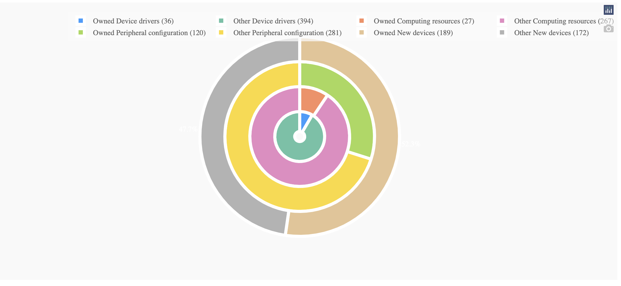
After resizing the browser n times (n>10)

The issue can be removed by removing textinfo='none' property in the pie chat.
Below is the code used to reproduce the graph(with Dash).
import dash
import dash_design_kit as ddk
import dash_core_components as dcc
import dash_html_components as html
from dash.dependencies import Input, Output
import plotly.express as px
import plotly.graph_objs as go
import numpy as np
import random

app = dash.Dash(__name__)
groups = ["Device Drivers", "Computing Resources", "Peripheral Configuration", "New Devices"]
fig = go.Figure()

holes = [0.2, 0.5, 2/3, 0.75]
domain = [[0.4, 0.6], [0.3, 0.7], [0.2, 0.8], [0.1, 0.9]]
prob = np.random.random(len(groups))
prob = prob/sum(prob)
prob = sorted(prob)
direction = "clockwise"
for i in range(0, len(prob)):
    count = random.randint(250, 500)
    data = [prob[i], 1 - prob[i]]
    soft_type = groups[i]
    trace = go.Pie(
        hole=holes[i],
        domain={"x": domain[i],
                "y": domain[i]},
        values=data,
        direction=direction,
        sort=False,
        hovertext=[int(count*prob[i]), int(count*(1-prob[i]))],
        hoverinfo="label+percent",
        labels=[f"Owned {str.capitalize(soft_type)} ({int(count*prob[i])})",
                f"Other {str.capitalize(soft_type)} ({int(count*(1-prob[i]))})",
                ],
        textinfo='none',
        #textfont_color='white',
        textposition='outside',
        marker={'line': {'color': 'white', 'width': 5}},
        showlegend=True
    )
    direction = "counterclockwise" if direction == "clockwise" else "clockwise"
    fig.add_trace(trace)
fig.update_layout(
    legend=dict(
        orientation="h",
        yanchor="bottom",
        y=-0.45,
        xanchor="left",
        x=0,
        itemclick="toggle"
    ),
    showlegend=True,
)

app.layout = ddk.App([
    ddk.Row(children=[
        ddk.Card(width=100, children=ddk.Graph(figure=fig)),
    ])
])


if __name__ == '__main__':
    app.run_server(debug=True)
Contributor guide
First steps
- Read the whole issue, then the project's contributing guide.
- Comment on the issue to say you are picking it up — it saves two people doing the same work.
- Fork the repository and make your change on a branch.
- Open a pull request that references the issue number.
Research direction
Start with the provided Dash reproduction and the linked CodePen, then resize the browser repeatedly with nested pie traces using textinfo='none'. Compare the circle centers before and after resizing and verify that the centers remain aligned while preserving the reported chart behavior.
Written by the indexing model from the issue text.
Assessment
- Tech stack
- javascript, python
- Domain
- data-visualization
- Issue type
- Bug
- Difficulty
- 4/5
- Estimated time
- 3-5 days
- Activity status
- Stale
- Clarity
- Mostly clear
- Newbie friendliness
- 42/100