Icon styles are inconsistent
- Ngôn ngữ chính
- Python
- Star
- 1.2k
- Fork
- 131
- Merge trung bình
- 1 ngày 11 giờ
- Pull request đã merge (30 ngày)
- 14
Mô tả
Sometimes we use colorful, shaded style icons:
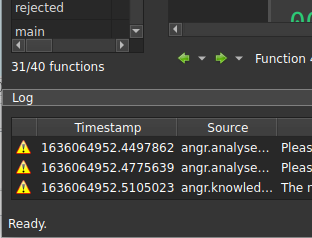
Other times we use "modern" flat, single color icons:

---
For reference, Ida uses the former approach:

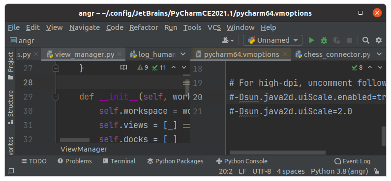
Some tools like PyCharm use flat icons, sometimes with color:
---
Personally I don't have a strong feeling one way or the other, but we should pick a style and be consistent. The latter approach has the benefit of using font-based icon sets which have many usable ones ready to go and we don't have to worry too much about design.
Hướng dẫn đóng góp
Chưa lập chỉ mục được hướng dẫn đóng góp cho kho mã nguồn này
Đánh giá
Issue này chưa được đánh giá.