DiscipleTools / DiscipleTools/disciple-tools-mobile-app
Improve the layout of the group health images
オープン
- 主要言語
- JavaScript
- スター
- 16
- フォーク
- 18
- PR マージ指標
- 30日以内にマージされた PR はありません
説明
Improve the layout of the group health images that display all the data (lots of the data is outside of the circles and overlaps)
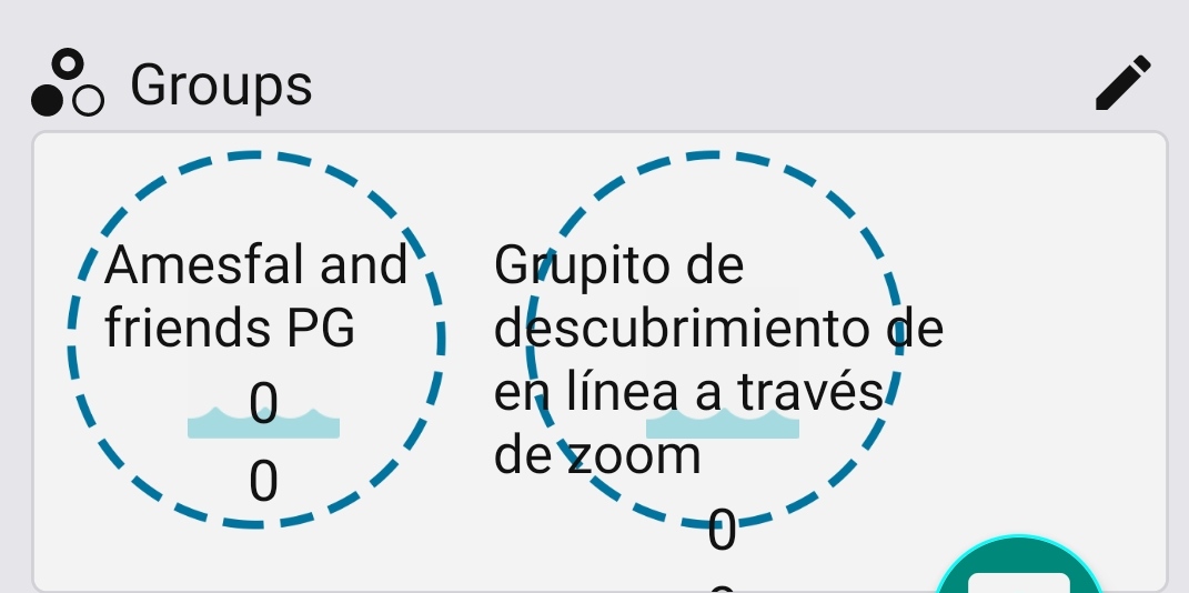
I suggest we have just the name of the group in the circle and have the count numbers below the circle next to the icons with a label they relate to.
コントリビューションガイド
調査の方向性
まず、React Native アプリ内でグループヘルス画像の UI を見つけ、添付画像に示されているレイアウトの問題を再現します。現在の配置を提案されたデザインと比較します。グループ名は円の中に残し、その下のアイコンの横にラベル付きのカウントを配置します。グループヘルスデータが円の外にはみ出したり、円と重なったりしなくなれば完了です。
索引モデルが issue の本文から書いたものです。
評価
- 技術スタック
- javascript, react-native
- 領域
- design, mobile
- issue の種類
- バグ
- 難易度
- 3/5
- 見積もり時間
- 1〜2日
- 活発さ
- 停滞
- 明瞭さ
- おおむね明確
- 初心者へのやさしさ
- 42/100