DiscipleTools / DiscipleTools/disciple-tools-mobile-app
Improve the layout of the group health images
- Dominant language
- JavaScript
- Stars
- 16
- Forks
- 18
- PR merge metrics
- No merged PRs in 30d
Description
Improve the layout of the group health images that display all the data (lots of the data is outside of the circles and overlaps)
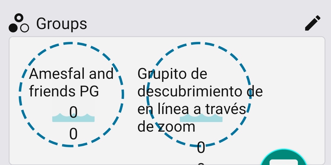
I suggest we have just the name of the group in the circle and have the count numbers below the circle next to the icons with a label they relate to.
Contributor guide
Research direction
Start by locating the group health image UI in the React Native app and reproduce the layout problem shown in the attached image. Compare the current arrangement with the suggested design: keep the group name in the circle and place labeled counts beside the icons below it. Done means the group health data no longer extends outside or overlaps the circles.
Written by the indexing model from the issue text.
Assessment
- Tech stack
- javascript, react-native
- Domain
- design, mobile
- Issue type
- Bug
- Difficulty
- 3/5
- Estimated time
- 1-2 days
- Activity status
- Stale
- Clarity
- Mostly clear
- Newbie friendliness
- 42/100