Pie chart and hover_data: multiple values are all shown under same label
未关闭
还没有人认领这个 Issue。
bug
P3
- 主要语言
- Python
- 星标
- 18.8k
- 派生
- 2.8k
- 平均合并
- 16 小时 26 分钟
- 30 天内合并 PR
- 21
描述
A simple recreation code
df_2007 = px.data.gapminder().query("year==2007")

fig = px.pie(df_2007, values="gdpPercap", names="lifeExp",
                 hover_name="country", hover_data=["continent", "pop"])

fig.show()
on hover it shows
continent = continent_name, pop_value
while pop as pop = %{customdata[1]}
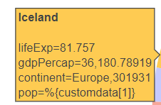
I believe this is not the expected behavior and it should work with pie like it does with scatter. If there is an alternative way, please let me know.
贡献指南
从这里开始
- 先读完整个 Issue,再读项目的贡献指南。
- 在 Issue 下留言说明你要接手 —— 这能避免两个人做同样的事。
- Fork 仓库,在一个分支上完成修改。
- 提交 Pull Request,并在描述里引用这个 Issue 编号。
调研方向
首先使用 px.data.gapminder() 运行提供的 Python 复现代码,并检查生成的饼图悬停输出。将 hover_data 的标签和值与预期的独立 continent 和 pop 条目进行比较,然后验证修正后的行为是否与 issue 中描述的现有散点图行为一致。
由索引模型根据 Issue 内容生成。
评估
- 技术栈
- python
- 领域
- data-visualization
- Issue 类型
- 缺陷
- 难度
- 3/5
- 预计耗时
- 1-2 天
- 活跃度
- 停滞
- 描述清晰度
- 基本清楚
- 新手友好度
- 35/100