Pie chart and hover_data: multiple values are all shown under same label
Open
Nobody has claimed this yet.
bug
P3
- Dominant language
- Python
- Stars
- 18.8k
- Forks
- 2.8k
- Avg merge
- 16h 26m
- Merged PRs (30d)
- 21
Description
A simple recreation code
df_2007 = px.data.gapminder().query("year==2007")

fig = px.pie(df_2007, values="gdpPercap", names="lifeExp",
                 hover_name="country", hover_data=["continent", "pop"])

fig.show()
on hover it shows
continent = continent_name, pop_value
while pop as pop = %{customdata[1]}
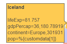
I believe this is not the expected behavior and it should work with pie like it does with scatter. If there is an alternative way, please let me know.
Contributor guide
First steps
- Read the whole issue, then the project's contributing guide.
- Comment on the issue to say you are picking it up — it saves two people doing the same work.
- Fork the repository and make your change on a branch.
- Open a pull request that references the issue number.
Research direction
Start by running the provided Python reproduction with px.data.gapminder() and inspect the generated pie-chart hover output. Compare the hover_data labels and values with the expected separate continent and pop entries, then verify that the corrected behavior matches the existing scatter behavior described in the issue.
Written by the indexing model from the issue text.
Assessment
- Tech stack
- python
- Domain
- data-visualization
- Issue type
- Bug
- Difficulty
- 3/5
- Estimated time
- 1-2 days
- Activity status
- Stale
- Clarity
- Mostly clear
- Newbie friendliness
- 35/100