Heatmap rectangles get extended along the x-axis
還沒有人認領這個 Issue。
- 主要語言
- R
- 星號
- 2.7k
- 分支
- 641
- PR 合併指標
- 30 天內沒有已合併 PR
描述
Hi,
I think I've detected an unexpected behavior.
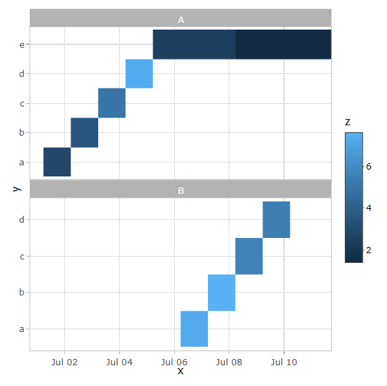
When I try to create a Heatmap using ggplotly(), the rectangles in the plot get extended along the x-axis when they shouldn't. See the reproducible example below.
library(ggplot2)
library(plotly)

date_range <- seq.POSIXt(as.POSIXct("2022-07-01 17:33:00"),
                         as.POSIXct("2022-07-10 17:33:00"),
                         by = "1 day")

set.seed(1)
data <- data.frame(
  x = date_range,
  y = rep(letters[1:5], 2),
  z = runif(10, 1, 8),
  g = sample(LETTERS[1:2], 10, replace = T)
)

p <- data %>%
  ggplot(aes(x, y)) +
  geom_raster(aes(fill = z)) +
  facet_wrap(~ g, nrow = 2, scales = "free_y")

p
The result from ggplot, as it is expected to be:
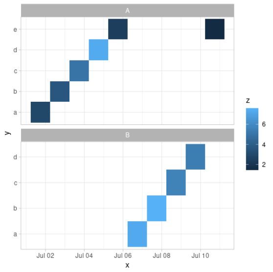
However, plotly results as you see below.
ggplotly(p)
sessionInfo()
R version 4.1.3 (2022-03-10) Platform: x86_64-pc-linux-gnu (64-bit) Running under: Ubuntu 20.04.4 LTSMatrix products: default
BLAS: /usr/lib/x86_64-linux-gnu/openblas-pthread/libblas.so.3
LAPACK: /usr/lib/x86_64-linux-gnu/openblas-pthread/liblapack.so.3locale:
[1] LC_CTYPE=en_US.UTF-8 LC_NUMERIC=C LC_TIME=en_US.UTF-8 LC_COLLATE=en_US.UTF-8 LC_MONETARY=en_US.UTF-8
[6] LC_MESSAGES=en_US.UTF-8 LC_PAPER=en_US.UTF-8 LC_NAME=C LC_ADDRESS=C LC_TELEPHONE=C
[11] LC_MEASUREMENT=en_US.UTF-8 LC_IDENTIFICATION=Cattached base packages:
[1] stats graphics grDevices datasets utils methods baseother attached packages:
[1] RColorBrewer_1.1-2 plotly_4.9.4.1 ggplot2_3.3.5loaded via a namespace (and not attached):
[1] highr_0.9 pillar_1.6.1 compiler_4.1.3 tools_4.1.3 digest_0.6.27 evaluate_0.14 jsonlite_1.7.2 lifecycle_1.0.0
[9] tibble_3.1.2 gtable_0.3.0 viridisLite_0.4.0 pkgconfig_2.0.3 rlang_0.4.11 reprex_2.0.0 cli_3.0.0 rstudioapi_0.13
[17] crosstalk_1.1.1 yaml_2.2.1 xfun_0.24 styler_1.5.1 withr_2.4.2 dplyr_1.0.7 httr_1.4.2 knitr_1.33
[25] fs_1.5.0 generics_0.1.0 vctrs_0.3.8 htmlwidgets_1.5.3 grid_4.1.3 tidyselect_1.1.1 glue_1.4.2 data.table_1.14.2
[33] R6_2.5.0 processx_3.5.2 fansi_0.5.0 rmarkdown_2.9 callr_3.7.0 purrr_0.3.4 tidyr_1.1.3 farver_2.1.0
[41] magrittr_2.0.1 ps_1.6.0 backports_1.2.1 scales_1.1.1 ellipsis_0.3.2 htmltools_0.5.1.1 colorspace_2.0-2 renv_0.13.2
[49] labeling_0.4.2 utf8_1.2.1 lazyeval_0.2.2 munsell_0.5.0 crayon_1.4.1
貢獻指南
從這裡開始
- 先讀完整個 Issue,再讀專案的貢獻指南。
- 在 Issue 下留言說明你要接手 —— 這能避免兩個人做同樣的事。
- Fork 儲存庫,在一個分支上完成修改。
- 送出 Pull Request,並在描述裡引用這個 Issue 編號。
研究方向
首先執行使用 geom_raster()、facet_wrap() 和 ggplotly() 的可重現 R 範例,以比較 ggplot2 和 Plotly 的輸出。追蹤 ggplotly() 對點陣幾何圖形的轉換,並驗證轉換後的熱圖矩形在未發生延伸的情況下保留其預期的 x 軸邊界。
由索引模型根據 Issue 內容生成。
評估
- 技術堆疊
- r
- 領域
- data-visualization
- Issue 類型
- 缺陷
- 難度
- 3/5
- 預估耗時
- 1-2 天
- 活躍度
- 停滯
- 描述清晰度
- 基本清楚
- 新手友好度
- 35/100