Heatmap rectangles get extended along the x-axis
Nessuno ha ancora preso questa issue.
- Lingua principale
- R
- Stelle
- 2.7k
- Fork
- 641
- Metriche di merge delle PR
- Nessuna PR unita negli ultimi 30g
Descrizione
Hi,
I think I've detected an unexpected behavior.
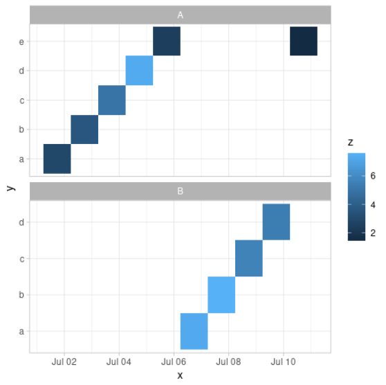
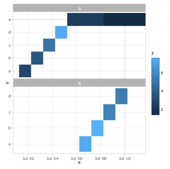
When I try to create a Heatmap using ggplotly(), the rectangles in the plot get extended along the x-axis when they shouldn't. See the reproducible example below.
library(ggplot2)
library(plotly)

date_range <- seq.POSIXt(as.POSIXct("2022-07-01 17:33:00"),
                         as.POSIXct("2022-07-10 17:33:00"),
                         by = "1 day")

set.seed(1)
data <- data.frame(
  x = date_range,
  y = rep(letters[1:5], 2),
  z = runif(10, 1, 8),
  g = sample(LETTERS[1:2], 10, replace = T)
)

p <- data %>%
  ggplot(aes(x, y)) +
  geom_raster(aes(fill = z)) +
  facet_wrap(~ g, nrow = 2, scales = "free_y")

p
The result from ggplot, as it is expected to be:
However, plotly results as you see below.
ggplotly(p)
sessionInfo()
R version 4.1.3 (2022-03-10) Platform: x86_64-pc-linux-gnu (64-bit) Running under: Ubuntu 20.04.4 LTSMatrix products: default
BLAS: /usr/lib/x86_64-linux-gnu/openblas-pthread/libblas.so.3
LAPACK: /usr/lib/x86_64-linux-gnu/openblas-pthread/liblapack.so.3locale:
[1] LC_CTYPE=en_US.UTF-8 LC_NUMERIC=C LC_TIME=en_US.UTF-8 LC_COLLATE=en_US.UTF-8 LC_MONETARY=en_US.UTF-8
[6] LC_MESSAGES=en_US.UTF-8 LC_PAPER=en_US.UTF-8 LC_NAME=C LC_ADDRESS=C LC_TELEPHONE=C
[11] LC_MEASUREMENT=en_US.UTF-8 LC_IDENTIFICATION=Cattached base packages:
[1] stats graphics grDevices datasets utils methods baseother attached packages:
[1] RColorBrewer_1.1-2 plotly_4.9.4.1 ggplot2_3.3.5loaded via a namespace (and not attached):
[1] highr_0.9 pillar_1.6.1 compiler_4.1.3 tools_4.1.3 digest_0.6.27 evaluate_0.14 jsonlite_1.7.2 lifecycle_1.0.0
[9] tibble_3.1.2 gtable_0.3.0 viridisLite_0.4.0 pkgconfig_2.0.3 rlang_0.4.11 reprex_2.0.0 cli_3.0.0 rstudioapi_0.13
[17] crosstalk_1.1.1 yaml_2.2.1 xfun_0.24 styler_1.5.1 withr_2.4.2 dplyr_1.0.7 httr_1.4.2 knitr_1.33
[25] fs_1.5.0 generics_0.1.0 vctrs_0.3.8 htmlwidgets_1.5.3 grid_4.1.3 tidyselect_1.1.1 glue_1.4.2 data.table_1.14.2
[33] R6_2.5.0 processx_3.5.2 fansi_0.5.0 rmarkdown_2.9 callr_3.7.0 purrr_0.3.4 tidyr_1.1.3 farver_2.1.0
[41] magrittr_2.0.1 ps_1.6.0 backports_1.2.1 scales_1.1.1 ellipsis_0.3.2 htmltools_0.5.1.1 colorspace_2.0-2 renv_0.13.2
[49] labeling_0.4.2 utf8_1.2.1 lazyeval_0.2.2 munsell_0.5.0 crayon_1.4.1
Guida per i contributori
Apri la guida per i contributori
Come iniziare
- Leggi tutta la issue e poi la guida ai contributi del progetto.
- Commenta sulla issue per dire che te ne occupi tu — evita che due persone facciano lo stesso lavoro.
- Fai un fork del repository e lavora su un branch.
- Apri una pull request che faccia riferimento al numero della issue.
Direzione di ricerca
Iniziare eseguendo l’esempio R riproducibile con geom_raster(), facet_wrap() e ggplotly() per confrontare l’output di ggplot2 e Plotly. Tracciare la conversion della geometria raster da parte di ggplotly() e verificare che i rettangoli della heatmap convertiti mantengano i limiti previsti dell’asse x senza estensione.
Scritto dal modello di indicizzazione a partire dal testo della issue.
Valutazione
- Stack tecnologico
- r
- Ambito
- data-visualization
- Tipo di issue
- Bug
- Difficoltà
- 3/5
- Tempo stimato
- 1-2 giorni
- Stato di attività
- Ferma
- Chiarezza
- Abbastanza chiara
- Idoneità per principianti
- 35/100