ggplotly changing the x-axis label while plotting the group charts in boxplot
未关闭
还没有人认领这个 Issue。
- 主要语言
- R
- 星标
- 2.7k
- 派生
- 641
- PR 合并指标
- 30 天内没有已合并 PR
描述
Sample Code:
library(ggplot2)
library(plotly)
data(mtcars)
mtcars$vs <- factor(mtcars$vs,
labels = c("A","B"))
df$carb = as.factor(df$carb)
df=mtcars[mtcars$vs == "A",]
gg <- ggplot(df, aes(x = vs, y = hp)) +
geom_boxplot() +
facet_wrap(~carb)
ggplotly(gg)
ggplot is properly showing x-axis label as "A" for each of the plots. But ggplotly showing label as "A" only for 1st column and for rest it is showing label as "1".
Please find screenshot for both:
ggplotly:
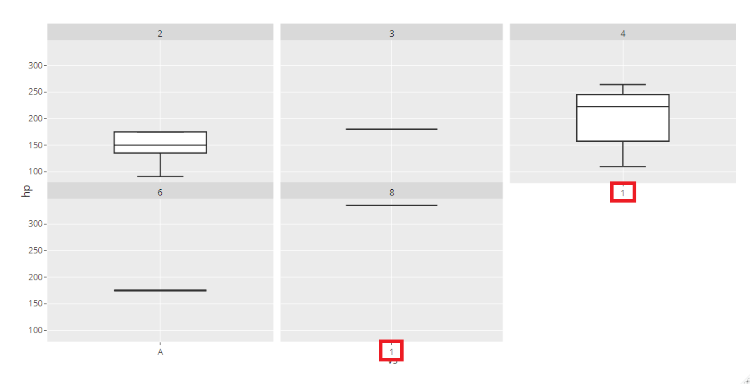
ggplot:

贡献指南
从这里开始
- 先读完整个 Issue,再读项目的贡献指南。
- 在 Issue 下留言说明你要接手 —— 这能避免两个人做同样的事。
- Fork 仓库,在一个分支上完成修改。
- 提交 Pull Request,并在描述里引用这个 Issue 编号。
调研方向
首先使用 ggplot2 和 plotly 运行示例代码,然后比较 facet_wrap(~carb) 各面板中 ggplot 和 ggplotly 的 x 轴标签。跟踪 ggplotly 渲染过程中 facet 标签的转换方式。当每个面板都显示因子标签 "A" 而不是 "1" 时,即表示完成。
由索引模型根据 Issue 内容生成。
评估
- 技术栈
- r
- 领域
- data-visualization
- Issue 类型
- 缺陷
- 难度
- 3/5
- 预计耗时
- 1-2 天
- 活跃度
- 停滞
- 描述清晰度
- 基本清楚
- 新手友好度
- 45/100