ggplotly changing the x-axis label while plotting the group charts in boxplot
Dieses Issue hat noch niemand übernommen.
- Vorherrschende Sprache
- R
- Sterne
- 2.7k
- Forks
- 641
- PR-Merge-Kennzahlen
- Keine gemergten PRs in 30 T.
Beschreibung
Sample Code:
library(ggplot2)
library(plotly)
data(mtcars)
mtcars$vs <- factor(mtcars$vs,
labels = c("A","B"))
df$carb = as.factor(df$carb)
df=mtcars[mtcars$vs == "A",]
gg <- ggplot(df, aes(x = vs, y = hp)) +
geom_boxplot() +
facet_wrap(~carb)
ggplotly(gg)
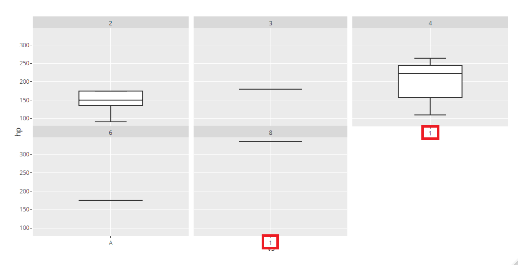
ggplot is properly showing x-axis label as "A" for each of the plots. But ggplotly showing label as "A" only for 1st column and for rest it is showing label as "1".
Please find screenshot for both:
ggplotly:
ggplot:

Beitragsleitfaden
Erste Schritte
- Lies das ganze Issue und danach den Beitragsleitfaden des Projekts.
- Schreib ins Issue, dass du es übernimmst — das erspart doppelte Arbeit.
- Forke das Repository und arbeite in einem Branch.
- Öffne einen Pull Request, der die Issue-Nummer nennt.
Rechercherichtung
Führe zunächst den Beispielcode mit ggplot2 und plotly aus und vergleiche dann die Beschriftungen der x-Achse in ggplot und ggplotly über die facet_wrap(~carb)-Panels hinweg. Verfolge, wie Facet-Beschriftungen während des ggplotly-Renderings konvertiert werden. Als erledigt gilt die Aufgabe, wenn jedes Panel das Faktorlabel "A" statt "1" anzeigt.
Vom Indexierungsmodell aus dem Issue-Text verfasst.
Bewertung
- Tech-Stack
- r
- Bereich
- data-visualization
- Issue-Typ
- Bug
- Schwierigkeit
- 3/5
- Geschätzter Aufwand
- 1-2 Tage
- Aktivitätsstatus
- Veraltet
- Klarheit
- Größtenteils klar
- Anfängerfreundlichkeit
- 45/100