ggplotly changing the x-axis label while plotting the group charts in boxplot
Nobody has claimed this yet.
- Dominant language
- R
- Stars
- 2.7k
- Forks
- 641
- PR merge metrics
- No merged PRs in 30d
Description
Sample Code:
library(ggplot2)
library(plotly)
data(mtcars)
mtcars$vs <- factor(mtcars$vs,
labels = c("A","B"))
df$carb = as.factor(df$carb)
df=mtcars[mtcars$vs == "A",]
gg <- ggplot(df, aes(x = vs, y = hp)) +
geom_boxplot() +
facet_wrap(~carb)
ggplotly(gg)
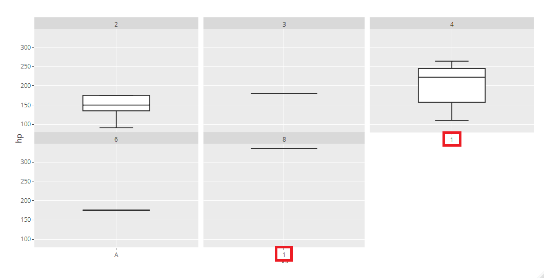
ggplot is properly showing x-axis label as "A" for each of the plots. But ggplotly showing label as "A" only for 1st column and for rest it is showing label as "1".
Please find screenshot for both:
ggplotly:
ggplot:

Contributor guide
First steps
- Read the whole issue, then the project's contributing guide.
- Comment on the issue to say you are picking it up — it saves two people doing the same work.
- Fork the repository and make your change on a branch.
- Open a pull request that references the issue number.
Research direction
Start by running the sample code with ggplot2 and plotly, then compare the x-axis labels in ggplot and ggplotly across the facet_wrap(~carb) panels. Trace how facet labels are converted during ggplotly rendering. Done means every panel displays the factor label "A" rather than "1".
Written by the indexing model from the issue text.
Assessment
- Tech stack
- r
- Domain
- data-visualization
- Issue type
- Bug
- Difficulty
- 3/5
- Estimated time
- 1-2 days
- Activity status
- Stale
- Clarity
- Mostly clear
- Newbie friendliness
- 45/100