adobe-fonts / adobe-fonts/source-han-sans
[Low priority] The curved hook stroke (撇鈎) might need improvements.
- 主要語言
- Python
- 星號
- 17.2k
- 分支
- 1.4k
- PR 合併指標
- 30 天內沒有已合併 PR
描述
I apologize if my terminology for font editing may not be correct.
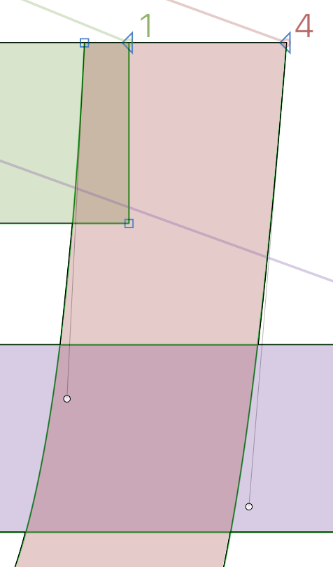
While the end result is not obvious, looking in the font software (Glyphs, for example), I see some minor kinks at the start of the curved-hook stroke (撇鈎), and only happens when looked at extremely close.
There is also another very minor issue with the left side also inconsistently having either a sharp (blue square) or smooth point (green circle), and that there is also two points put very close to each other (probably as a support node?), but that's not the main point as they are normally hidden. Perhaps I would like the idea of cleaner shapes, so that's why I point it out.
Unfortunately, virtually every character that incorporates the curved-hook stroke (撇鈎) has the flaw, for example, 馬, 每, 与, 曷, 方 and a lot more, across all locales, which means tens of thousands of glyphs and a lot of laborious work if this is to be improved. Therefore I am also putting this issue as "low priority" in the title, and I do not expect this to be addressed, even for the long term. (**EDIT:** 也 is not affected)
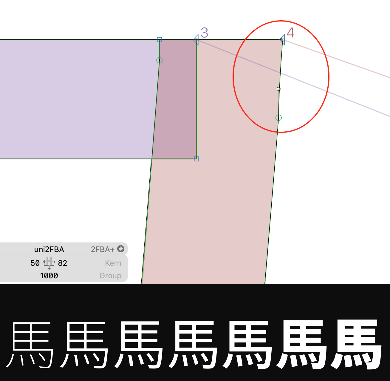
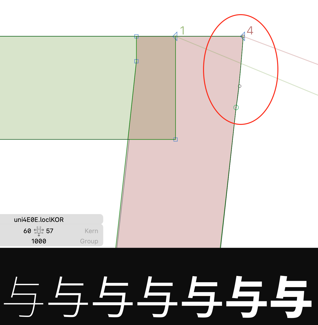
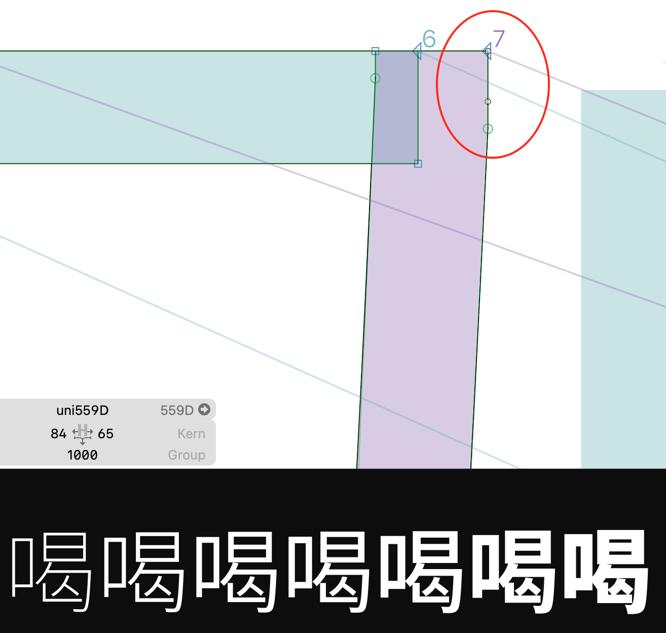
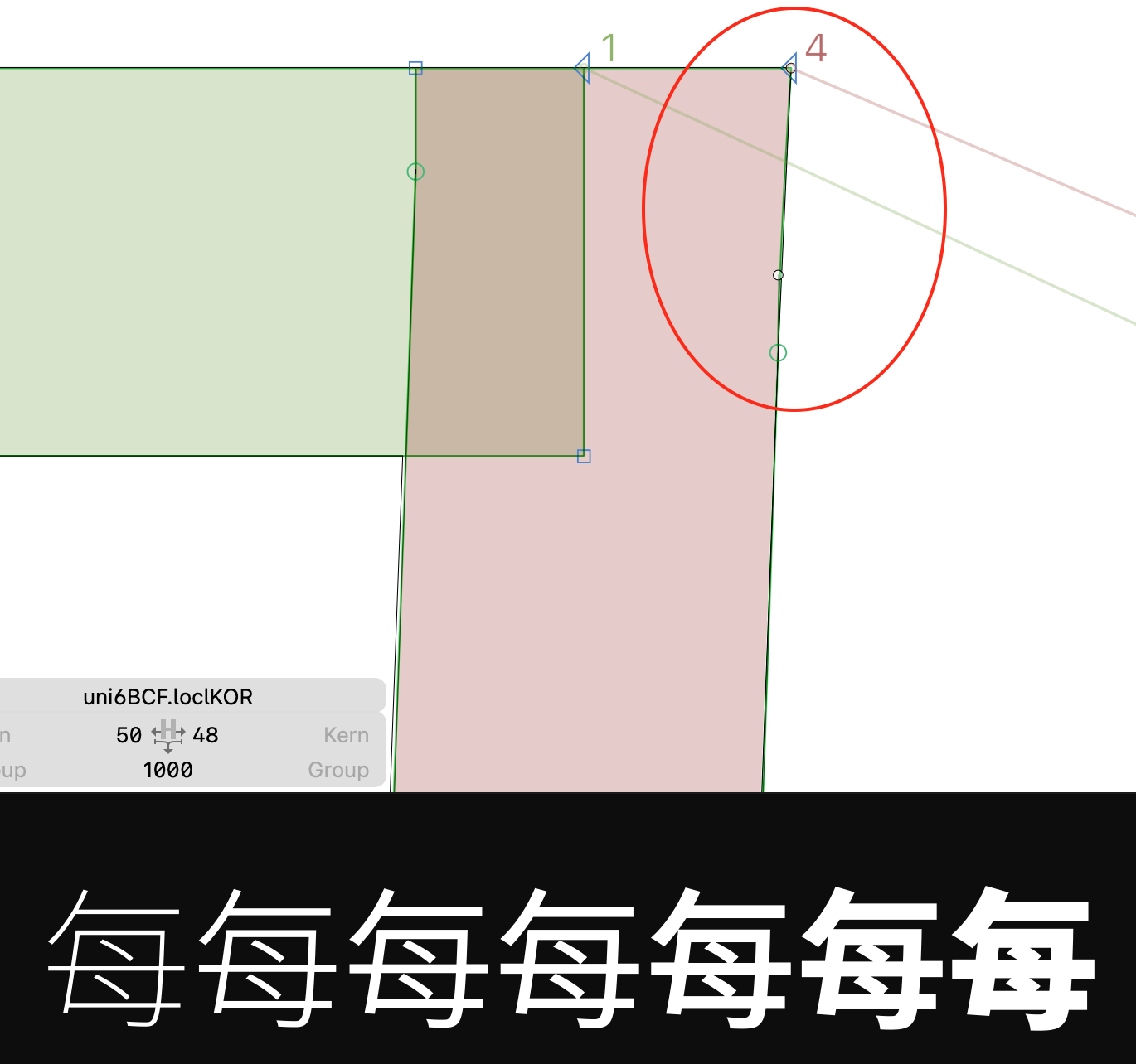
The solution is to remove the kinks and make the top left and right corner have a sharp curve node, as demonstrated in this picture. This could make for cleaner shapes.
貢獻指南
這個儲存庫沒有索引到貢獻指南
評估
這個 Issue 還沒有評估資料。